Address
304 North Cardinal St.
Dorchester Center, MA 02124
Work Hours
Monday to Friday: 7AM - 7PM
Weekend: 10AM - 5PM
| Settings | Descriptions |
| Show breadcrumbs | Show a set of links that tells the customer where they are on the site, and allows them to return to a previous page. You can show/hide the breadcrumbs on the product page. |
Learn more about media types.
| Settings | Description |
| Desktop media position | Right (default): Displays the image on the right and text on the left. Left: Displays the image on the left and text on the right. The position is automatically optimized for mobile. |
| Desktop layout | Stacked: ——————– 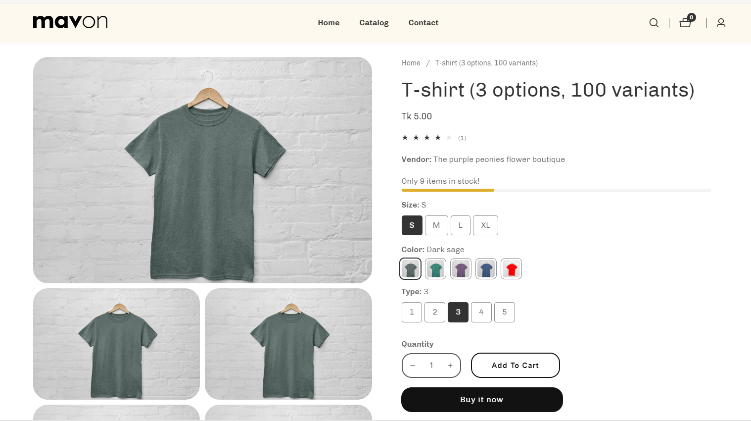 2 columns: ——————- 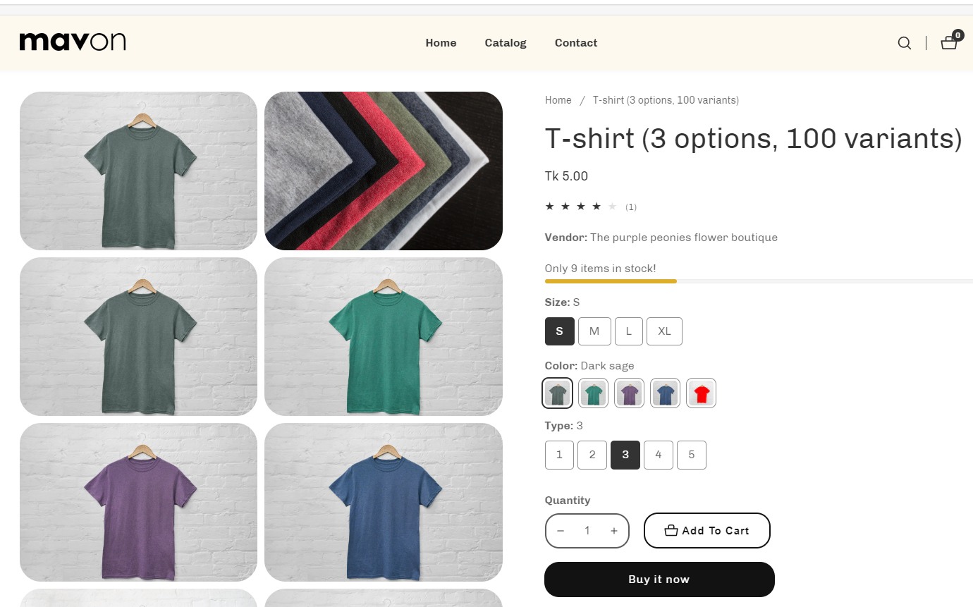 Thumbnails: ———————- 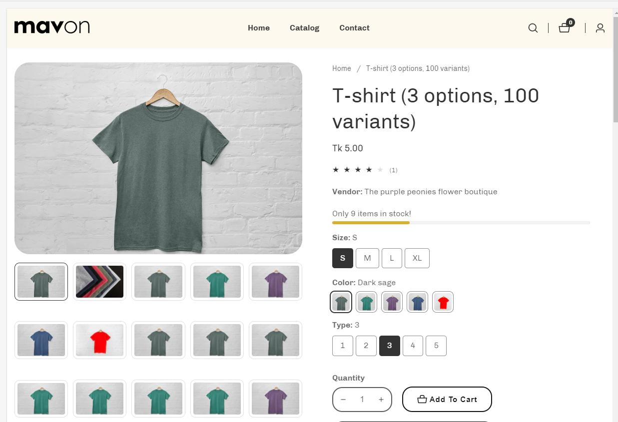 Thumbnails carousel (default): —————————————–  |
| Media size | Small: The image will display in one-third of the entire section width. Medium: The image will be displayed at half the width of the entire section. Large: The image will display in two-thirds of the entire section width. Media is automatically optimized for mobile |
| Image height | Adapt to image: Uses the aspect ratio of the collection images is cropped. Small: This is the smallest height of the lookbook image. Desktop height: 500px, Mobile height: 304px Medium: This is the medium height of the lookbook image. Desktop height: 600px, Mobile height: 384px Large: This is the maximum height of the lookbook image. Desktop height: 700px, Mobile height: 435px |
| Mobile layout | |
| Hide other variants’ media after selecting a variant | Images of other variants are hidden from view when one variant is selected. When the variant is deselected, the images reappear. |
| Enable sticky product information on large screens | You can enable sticky product information on the large screen. |
| Enable video looping | Allows for repeat playback of the video. The replay must be initiated by a customer click. |
| Settings | Description |
| Desktop top space | You can enable the top offset of the product page content. |
| Settings | Description |
| Enable | As customers browse and scroll, keep the add-to-cart button visible. |
| Settings | Description |
| Desktop: Padding top | The section’s top inner space height is determined. From 0 to 150 px, will be incremented by 5px. It will affect the desktop. |
| Desktop: Padding bottom | The section’s bottom inner space height is determined. From 0 to 150 px, will be incremented by 5px. It will affect the desktop. |
| Mobile: Padding top | The section’s top inner space height is determined. From 0 to 150 px, will be incremented by 5px. It will affect the mobile. |
| Mobile: Padding bottom | The section’s bottom inner space height is determined. From 0 to 150 px, will be incremented by 5px. It will affect the desktop. |
You can add the following blocks to your Featured product section in your store:
| Text | Text: You can add text and dynamic sources. Text style: Choose between Body, Subtitle, or Uppercase. |
| Title | Displays the title of the product. |
| Price | Displays pricing information for the product, such as price and compare at price. |
| Countdown timer | 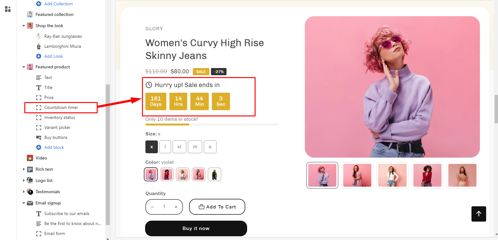 Displays an active countdown clock set to expire at a given time. For example, You can give a discount for a specific product. Then the timer will present a discount period. To display the counter timer, you must set up the meatfield. Learn more about adding countdown metafield |
| Inventory status | 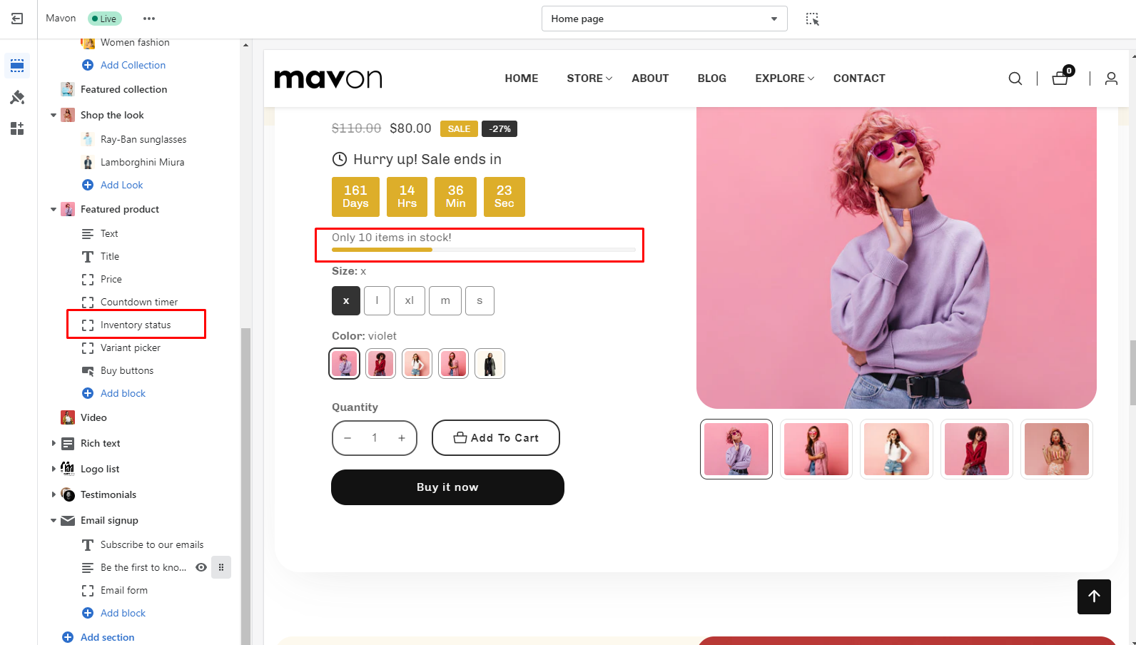 Displays a message informing customers about product availability: |
| Settings | Description |
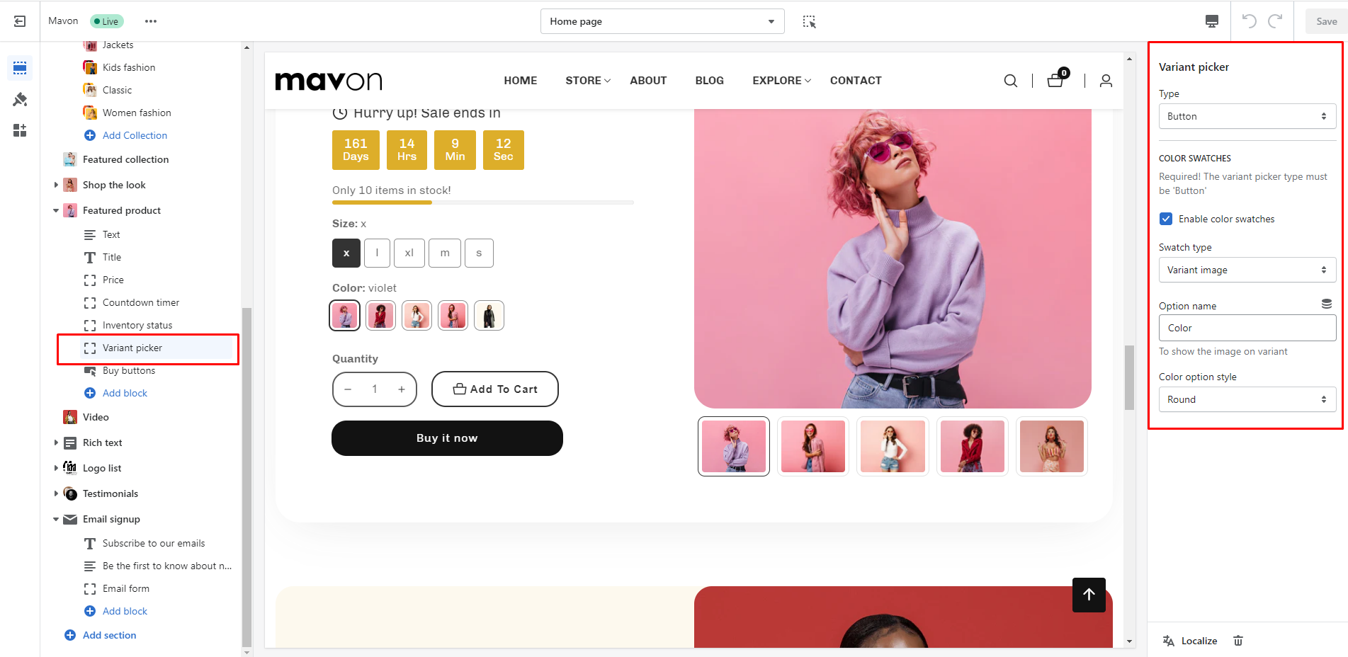
| Type: | Dropdown: ———————- 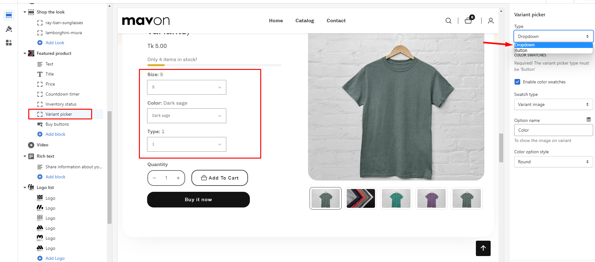 Button (default): ———————– 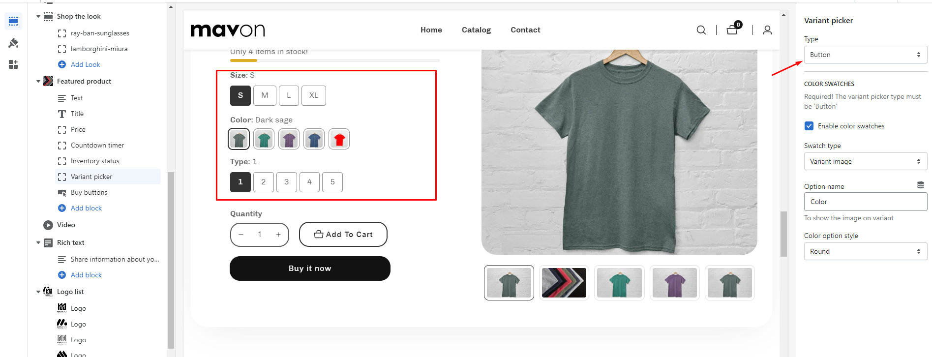 |
| COLOR SWATCHES | Required! The variant picker type must be ‘Button’ |
| Enable color swatches | If you enable it, Color variants are shown in swatches. |
| Swatch type | Variant image (default): After adding an image to your variant, if you select this option from the settings the image will be displayed in your specific variant. Color swatch: If you add a color name to a specific product’s Color options and that color name is Color Names Support in Browsers. The color will be displayed on your specific variant. Example color name supported by all browsers 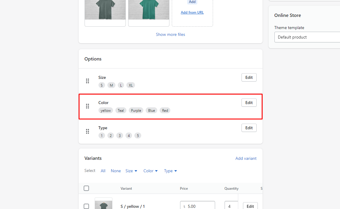 IMPORTANT: If you need a custom color for your specific product variant. Then you can add custom colors using a metafield. How to add metafield for the custom color for the variant, go to this page. Learn more |
| Option name | This is a text field. To display the image in the variant, you must enter the same name as the product variant option name here, Shopify admin product variant option name: —————————————— 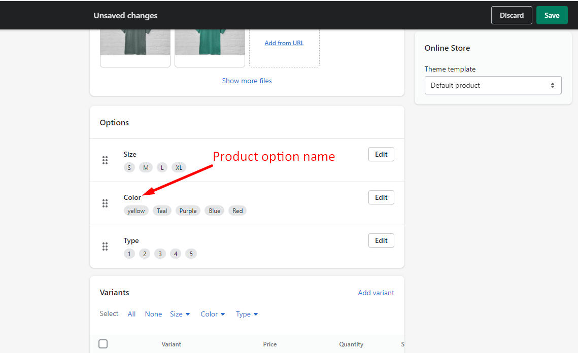 Customizer product variant option name: ———————————————— 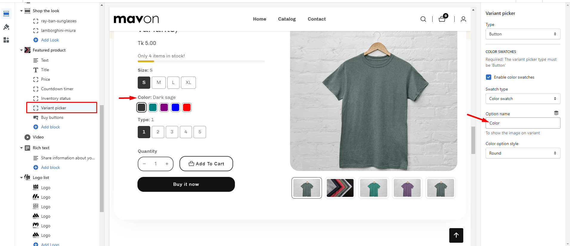 |
| Color option style | Round: If you select it, the variant’s corners will be rounded. Square: If you select it, the variant’s corners will be square. |
| LIMIT | You can add this block a maximum of 1 time. |
| Settings | Description |
| Show quantity button | 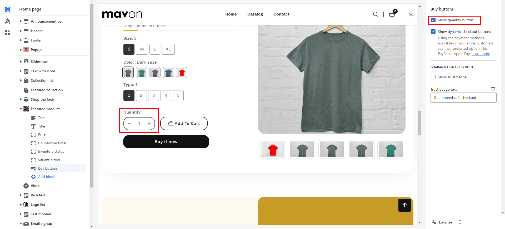 This is the quantity button for the cart. By default, the quantity is 1. If the customer wants to increase the quantity, he or she must use the quantity field. You can now enable/disable the field as needed. |
| Show dynamic checkout buttons | You can enable/disable the button. Using the payment methods available in your store, customers see their preferred option, like PayPal or Apple Pay. Learn more |
| GUARANTEE SAFE CHECKOUT | |
| Show trust badge | You can show/hide the trust badge in the product section. |
| Trust badge text | You can add text to the trust badge |
| LIMIT | You can add this block a maximum of 1 time. |
IMPORTANT
There are two additional fields that we’ve made the default. If you need to add more fields, you should hire a Shopify expert.
| Settings | Description |
| Show text field | This is a text field. Customers can add text to the cart. You can show/hide the text field from the product section. |
| Text label | You can change the text field label. |
| Show file field | This is the file field. Customers can add a file to the cart. You can show/hide the file field from the product section. |
| File label | You can change the file field label. |
| LIMIT | You can add this block a maximum of 1 time. |
| Settings | Description |
| Text | You can add a text to social share |
| Enable share link | This is a field to copy the link to share. You can enable/disable the link. |
| Enable facebook share link | This is a field to share links on Facebook. You can enable/disable the field |
| Enable twitter share link | This is a field to share links on Twitter. You can enable/disable the field |
| Enable Pinterest share link | This is a field to share links on Pinterest. You can enable/disable the field |
| Learn more details | If you include a link in social media posts, the page’s featured image will be shown as the preview image. Learn more. ——- A store title and description are included with the preview image. Learn more. |
It’s a collapsible tab
| Settings | Description |
| Heading | This is the title of the product details collapsible tab. |
| Icon | This is the icon of the product details collapsible tab. You can add any icon from the icon select options. |
| Product Description | Short description: If you select it, you have to use a metafield to show the description for the specific product. How to use product short description meatfield, please check the article Full description: If you select it, the default product description will be displayed. |
| Description word count | You can set a limit to the product description, If ‘Full Description’ is selected, then it will be applicable |
| Settings | Description |
| Heading | This is the text of the “Size Guide” button. |
| Icon | This is the icon of the “Size Guide” button. You can add any icon from the icon select options. |
| Popup content | RichText: This is the ext for the size guide popup content. Learn more about RichText Editor |
| Select page | You can select the specific page for the size guide popup. |
| Settings | Description |
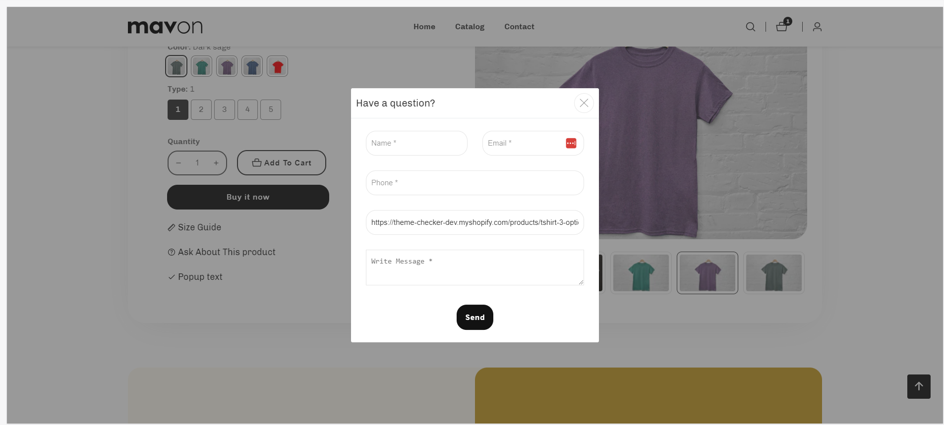
| Popup button label | This is the label of the popup button label. |
| Icon | This is the icon of the “Pop-up contact form” button. You can add any icon from the icon select options. |
| POPUP CONTENT | |
| Contact form label | This is the text of the popup title. |
| Submit button | This is the text for the contact form submit button. |
| Name placeholder | This is the input name placeholder text |
| Email placeholder | This is the input email placeholder text |
| Phone placeholder | This is the input phone placeholder text |
| Product link placeholder | This is the input link placeholder text |
| Message body | This is the textarea message placeholder text |
| Settings | Description |
| Pop-up text label | This is the label of the popup button label. |
| Icon | This is the icon of the “Pop-up text” button. You can add any icon from the icon select options. |
| Popup content | RichText: This is the text for the popup content. Learn more about RichText Editor |
| Select page | You can select the specific page for the size guide popup. |
| Settings | Description |
| Heading | This is the title of the collapsible tab. |
| Tab content | This is the icon of the product details collapsible tab. You can add any icon from the icon select options. |
| Tab content from page | RichText: This is the text for the tab content. Learn more about RichText Editor |
| Icon | This is the icon of the “collapsible tab” button. You can add any icon from the icon select options. |
| Settings | Description |
| Custom liquid | You can show data using the liquid from the custom liquid field. |
| Vendor | You can show the product vendor name in the section. |
| Type | You can show the product type in the section. |
| SKU | You can show the product SKU in the section. |
| Barcode | You can show the product Barcode in the section. |
| Reviews | You need to install the product review app. Get review app |
Recommendations
Dynamic recommendations use order and product information to change and improve over time. Learn more
| Settings | Description |
| Heading | RichText: You can add a section title using the RichText editor. Learn more about this |
| Heading size | Large: This is the large text size of the section heading. Desktop size: 50px, Mobile Size: 30px Medium (Default): This is the medium text size of the section heading. Desktop size: 40px, Mobile Size: 28px Small: This is the medium text size of the section heading. Desktop size: 32px, Mobile Size: 25px |
| Subheading | This is the section subtitle. |
| Desktop heading alignment | You can change the content alignment only for desktop, Left: Aligns the content to the left. Right: Aligns the content to the right. Center: Aligns the content to the center. |
| Mobile heading alignment | You can change the content alignment only for mobile, Left: Aligns the content to the left. Right: Aligns the content to the right. Center: Aligns the content to the center. |
| Settings | Description |
| Image ratio | Adapt to image: Uses the aspect ratio of the collection images is cropped. Portrait: uses a 2:3 cropping ratio to the images. Square: uses a 1:1 cropping ratio to the images. Landscape: uses a 3:2 cropping ratio to the images. |
| Round the corners of the image | If you enable it, the product image corners will be rounded. |
| Show second image on hover | Displays the second product image if the customer hovers their cursor over the product image. |
| Show title | You can display show/hide product titles for specific sections. |
| Show price | You can display show/hide product prices for specific sections. |
| Show vendor | You can display show/hide product vendors for specific sections. |
| Show product rating | You can display show/hide product ratings for specific sections. |
| Show badges | You can display show/hide product badges for specific sections. |
| Badge position on desktop | You can change position follow the options, – Top left (default) – Top center – Top right – Bottom left – Bottom center – Bottom right NOTE: Position is automatically optimized for mobile. |
| Enable quick shop button | You can enable/disable the quick shop button for the specific section |
| Quick shop style on desktop | There are 2 styles for the quick shop button. This only applies to a desktop device. – Icon button – Text button NOTE: The icon button is always displayed for mobile. |
| Quick shop position on desktop | You can change position follow the options, – Top left – Top center – Top right – Bottom left – Bottom center – Bottom right (default) |
| Show countdown | You can enable/disable countdown time. IMPORTANT: You must need to configure a countdown metafield to display the countdown timer for a specific product. Learn more |
| Color scheme for countdown | You can change the color of the countdown timer. |
| Position the countdown on the image for desktop | If you enable it, the countdown timer will be positioned over the product image. By default, the countdown time will be displayed below the product image. |
| Settings | Description |
| Maximum products to show | The number of products to display from the collection. Range will be increased by 2. Minimum amount of 2 and maximum 50. |
| Number of columns on desktop | You can select a product column per row following the options (2, 3, 4). This only applies to a desktop device. |
| Number of columns on mobile | You can select a product column per row following the options (1, 2). This only applies to a mobile device. |
| Settings | Description |
| Enable | You can enable/disable the slider for this section. By default, slider mode is enabled. |
| Auto-rotate slides | A slide show can be set to play automatically. |
| Change slides every | Determine how frequently to update slides. Minimum 1s and maximum 10s |
| Show navigation | You can hide/show slider navigation next/prev arrow button. You can go to the next/prev slide by clicking the next/prev buttons. |
| Hover background color | This is the navigation button hover background color. |
| Hover text color | This is the navigation button text hover color, |
| Settings | Description |
| Desktop: Padding top | The section’s top inner space height is determined. From 0 to 150 px, will be incremented by 5px. It will affect the desktop. |
| Desktop: Padding bottom | The section’s bottom inner space height is determined. From 0 to 150 px, will be incremented by 5px. It will affect the desktop. |
| Mobile: Padding top | The section’s top inner space height is determined. From 0 to 150 px, will be incremented by 5px. It will affect the mobile. |
| Mobile: Padding bottom | The section’s bottom inner space height is determined. From 0 to 150 px, will be incremented by 5px. It will affect the desktop. |
| Settings | Description |
| Heading | RichText: You can add a section title using the RichText editor. Learn more about this |
| Heading size | Large: This is the large text size of the section heading. Desktop size: 50px, Mobile Size: 30px Medium (Default): This is the medium text size of the section heading. Desktop size: 40px, Mobile Size: 28px Small: This is the medium text size of the section heading. Desktop size: 32px, Mobile Size: 25px |
| Subheading | This is the section subtitle. |
| Desktop heading alignment | You can change the content alignment only for desktop, Left: Aligns the content to the left. Right: Aligns the content to the right. Center: Aligns the content to the center. |
| Mobile heading alignment | You can change the content alignment only for mobile, Left: Aligns the content to the left. Right: Aligns the content to the right. Center: Aligns the content to the center. |
| Settings | Description |
| Maximum products to show | The number of products to display from the collection. Range will be increased by 2. Minimum amount of 2 and maximum 50. |
| Number of columns on desktop | You can select a product column per row following the options (2, 3, 4). This only applies to a desktop device. |
| Number of columns on mobile | You can select a product column per row following the options (1, 2). This only applies to a mobile device. |
| Settings | Description |
| Enable | You can enable/disable the slider for this section. By default, slider mode is enabled. |
| Auto-rotate slides | A slide show can be set to play automatically. |
| Change slides every | Determine how frequently to update slides. Minimum 1s and maximum 10s |
| Show navigation | You can hide/show slider navigation next/prev arrow button. You can go to the next/prev slide by clicking the next/prev buttons. |
| Hover background color | This is the navigation button hover background color. |
| Hover text color | This is the navigation button text hover color, |
| Settings | Description |
| Desktop: Padding top | The section’s top inner space height is determined. From 0 to 150 px, will be incremented by 5px. It will affect the desktop. |
| Desktop: Padding bottom | The section’s bottom inner space height is determined. From 0 to 150 px, will be incremented by 5px. It will affect the desktop. |
| Mobile: Padding top | The section’s top inner space height is determined. From 0 to 150 px, will be incremented by 5px. It will affect the mobile. |
| Mobile: Padding bottom | The section’s bottom inner space height is determined. From 0 to 150 px, will be incremented by 5px. It will affect the desktop. |