Address
304 North Cardinal St.
Dorchester Center, MA 02124
Work Hours
Monday to Friday: 7AM - 7PM
Weekend: 10AM - 5PM
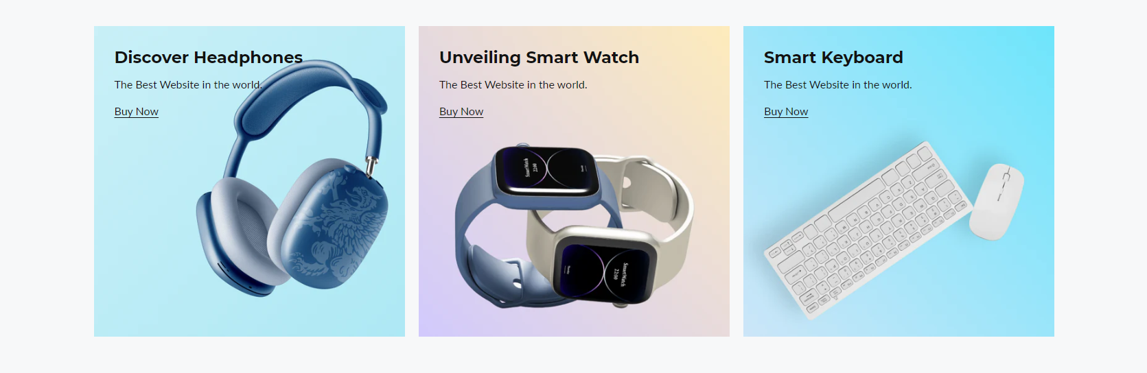
Section header
| Settings | Description |
|---|---|
| Heading | Large text for the title of the section. |
| Heading size | The size of the heading text: -Small -Medium -Large |
| Subheading | This is the section subtitle. |
| Desktop heading alignment | Left: Aligns the content to the left. Right: Aligns the content to the right. Center: Aligns the content to the center. |
| Mobile heading alignment | Left: Aligns the content to the left. Right: Aligns the content to the right. Center: Aligns the content to the center. |
| Settings | Description |
|---|---|
| Desktop layout | Choose your preferred desktop layout from the following options: Grid: Organize your items in a structured grid format, making it easy to locate and manage your content. Mosaic: Arrange items in a freeform mosaic style, allowing for a more dynamic and visually appealing display. Slider: View items in a horizontal or vertical slider, perfect for browsing through content in a linear fashion. |
| Number of columns on desktop | Select the number of columns in the desktop view from now on. Note: This is only applicable to the Grid and Mosaic layouts. |
| Number of columns on mobile | Select the number of columns in the mobile view from now on. Note: This is only applicable to the Grid and Slider layouts. |
| Stack on mobile | Enabling Mobile Stacking for Responsive Layouts |
| Settings | Description |
|---|---|
| Image ratio | Shopify allows you to customize the image ratio for product images in your store. You can choose from several predefined ratios to ensure your product images are displayed optimally across different devices and layouts. Here are the available options: -Adapt to First Image -Square -Portrait -Landscape -Circle Note: It works unless you enable the “Mosaic” layout |
| Image ratio for mosaic layout | In the Mosaic layout for your Shopify store, selecting the correct image ratio is crucial for ensuring that your images are displayed in an appealing and consistent manner. Shopify provides two primary options for managing image ratios: “Adapt to image” and “Auto best-fit.” This documentation will guide you through the process of selecting and applying these settings. |
| Content position | You can change position by following the options, – Top – Middle – Bottom |
| Content alignment | You can change position by following the options, – Top – Middle – Bottom |
| Round corner | Enable rounded corners for the banner image. |
| Show content below the images | Enable the display of content beneath the images. |
| Settings | Description |
|---|---|
| Show button | Enable the visibility of the “Shop Now” button in the specified section. |
| Button label | You can input the label for your button here. |
| Button link | This is a link for the button. |
| Button type | Primary: Use a solid background button style Secondary: Use outline button style |
| Button size | You can change the button size by following the options, (Large, medium, small) |
| Settings | Description |
|---|---|
| Auto rotate slides | This feature allows you to automatically rotate slides within your presentation. Once enabled, the slides will rotate at specified intervals, enhancing the visual experience of your presentation. |
| Change slides every | Easily modify how often slides switch in your presentation. Access settings, find “Transition Frequency,” and select your preferred timing, from seconds to minutes. Tailor your presentation’s pace effortlessly for smooth transitions. |
| Show navigation | To enable navigation features, simply toggle on the “Show Navigation” option. |
| Navigation color | Modify the navigation color in this section. |
| Settings | Description |
|---|---|
| Desktop image | Choose your desktop banner image here. |
| Mobile image | Choose your mobile banner image here. |
| Heading | Large text for the title of the section. |
| Button size | You can change the button size follow the options, (Large, medium, small) |
| Description | Medium text for the subtitle of the section. |
| Button label | This button is for the countdown section. Leave the label blank to hide the button. |
| Button link | This is a link for the button. |
| Enable the link on the entire banner | To make the entire banner clickable, you can enable the link in the entire banner area by enabling the checkbox. |
| Button type | Primary: Use a solid background button style Secondary: Use outline button style |
| Button size | You can change the button size by following the options, (Large, medium, small) Note: Works on the primary/secondary button |
| Link button size | You can change the button size by following the options, (Large, small) Note: Works on the link button |
| Image overlay opacity | Adjust the transparency of your image overlay using an opacity range from 0% to 100% |
| Inside content padding | Choose the appropriate inside content padding size: -Extra Large -Large -Medium -Small Note: It works unless you enable the “Show content below the image” from section general settings. |
| Override general settings | When enabled, the “General Settings” section of the “BANNER CARD” will be overridden. |
| Content position | You can change position by following the options, – Top – Middle – Bottom |
| Content Alignment | You can change alignment by following the options, – Left – Center – Right |
| Colors | Easily configure the colors for your text and buttons using the options below. |
| Settings | |
|---|---|
| Desktop: Padding top | The section’s top inner space height is determined. From 0 to 150 px, will be incremented by 5px. It will affect the desktop. |
| Desktop: Padding bottom | The section’s bottom inner space height is determined. From 0 to 150 px, will be incremented by 5px. It will affect the desktop. |
| Mobile: Padding top | The section’s top inner space height is determined. From 0 to 150 px, will be incremented by 5px. It will affect the mobile. |
| Mobile: Padding bottom | The section’s bottom inner space height is determined. From 0 to 150 px, will be incremented by 5px. It will affect the desktop. |