Address
304 North Cardinal St.
Dorchester Center, MA 02124
Work Hours
Monday to Friday: 7AM - 7PM
Weekend: 10AM - 5PM
| Settings | Description |
|---|---|
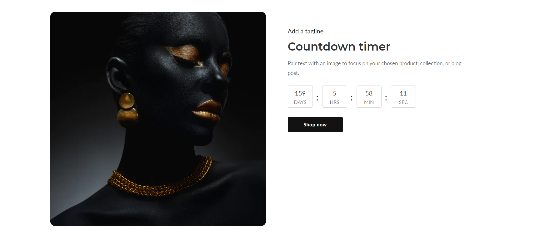
| Image | The image for the section. |
| Image height | Adapt to image: Uses the aspect ratio of the slider’s first image the other images are cropped. Small: This is the smallest height of the slider. Desktop height: 315px, Mobile height: 195px Medium: This is the medium height of the slider. Desktop height: 500px, Mobile height: 300px Large: This is the maximum height of the slider. Desktop height: 700px, Mobile height: 430px |
| Desktop image placement | The layout options for this section on the desktop are as follows: Image first: Displays the image on the left. Image second: Displays the text on the left. Note: Image first is the default mobile layout. |
| Desktop content position | You can change position follow the options, – Top – Middle – Bottom |
| Desktop content alignment | You can change alignment follow the options, – Left – Center – Right |
| Round corner | If you enable it, the section corners will be rounded. |
| Make section full width | You can display images and content full width in a section container. |
| Settings | Description |
|---|---|
| Enable | If you enable it, the countdown timer will be visible. |
| Year | Enter the year you desire the countdown to conclude. Please format the year as follows: 2023. |
| Month | Choose the month when you want the countdown to end. |
| Day | Choose the Day when you want the countdown to end. |
| Box border style | Box Border Style Options: Rounded: This style features smooth, curved edges, providing a softer appearance to the box border. Square: This style maintains sharp, angular edges, giving a more defined and geometric look to the box border. |
| Settings | Description |
|---|---|
| Heading | Large text for the title of the section. |
| Subheading | Medium text for the subtitle of the section. |
| Text | This is the text for the countdown section. |
| Button label | This button is for the countdown section. Leave the label blank to hide the button. |
| Button link | This is a link for the button. |
| Button type | Primary: Use a solid background button style Secondary: Use outline button style |
| Button size | You can change the button size follow the options, (Large, medium, small) |
| Settings | Description |
|---|---|
| Color scheme | This is a color scheme option to change the color of the section |
| Replace with your custom colors | “Enable to replace with your custom colors” allows you to activate the feature for substituting default colors with your own personalized color choices. |
| Settings | Description |
|---|---|
| Desktop: Padding top | The section’s top inner space height is determined. From 0 to 150 px, will be incremented by 5px. It will affect the desktop. |
| Desktop: Padding bottom | The section’s bottom inner space height is determined. From 0 to 150 px, will be incremented by 5px. It will affect the desktop. |
| Mobile: Padding top | The section’s top inner space height is determined. From 0 to 150 px, will be incremented by 5px. It will affect the mobile. |
| Mobile: Padding bottom | The section’s bottom inner space height is determined. From 0 to 150 px, will be incremented by 5px. It will affect the desktop. |