Address
304 North Cardinal St.
Dorchester Center, MA 02124
Work Hours
Monday to Friday: 7AM - 7PM
Weekend: 10AM - 5PM
| Settings | Description |
| Heading | RichText: You can add a section title using the RichText editor. Learn more about this |
| Heading size | Large: This is the large text size of the section heading. Desktop size: 50px, Mobile Size: 30px Medium (Default): This is the medium text size of the section heading. Desktop size: 40px, Mobile Size: 28px Small: This is the medium text size of the section heading. Desktop size: 32px, Mobile Size: 25px |
| Subheading | This is the section subtitle. |
| Heading alignment | Left: Aligns the content to the left. Right: Aligns the content to the right. Center: Aligns the content to the center. |
| Settings | Description |
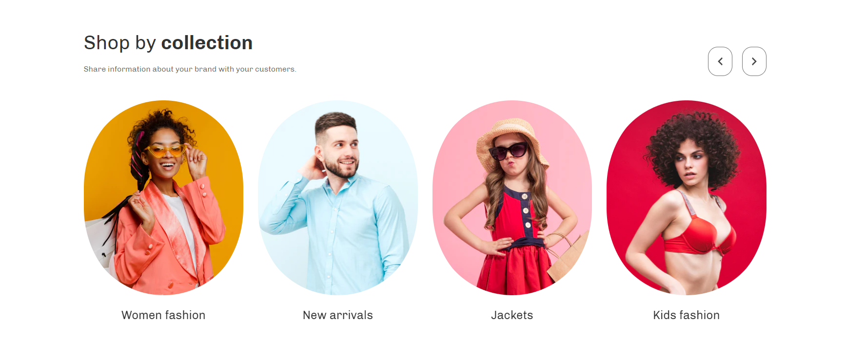
| Image ratio | Adapt to image: Uses the aspect ratio of the collection images is cropped. Portrait: uses a 2:3 cropping ratio to the images. Square: uses a 1:1 cropping ratio to the images. Circle: Images are cropped to a 100% rounded. |
| Round the corners of the image | If you enable it, the collection image corners will be rounded. |
| Show product count | This is an option to show how many products are in a collection. |
| Enable “View all” button | if list includes more collections than shown |
| Layout | Grid: If you select this, the collection will be displayed left to right with an equal size of columns. Collage: If you select this, the first 2 collections will be displayed in the first row in 2 columns. And the remaining collections will be displayed in 3 columns per row. Variation of columns per row will only affect desktop devices. Slider (Default): If you select this, the collections will be activated on the slider mode. |
| Number of columns on desktop | You can select a product column per row following the options (1, 2, 3, 4, 5). Except for the collage layout, Works on all other layouts. |
If you enable the layout slide, the slider settings will be working fine
| Settings | Description |
| Auto-rotate slides | A slide show can be set to play automatically. |
| Change slides every | Determine how frequently to update slides. Minimum 1s and maximum 10s |
| Show navigation | You can hide/show slider navigation next/prev arrow button. You can go to the next/prev slide by clicking the next/prev buttons. |
| Hover background color | This is the navigation button hover background color. |
| Hover text color | This is the navigation button text hover color, |
| Settings | Description |
| Collection | Select collection: You can display any collection for a specific collection card. |
| Image | You can add a collection image from the customizer. Optional! Instead of the collection’s image, the selected image will be displayed. |
| Settings | Description |
| Section title alignment | Left: Aligns the content to the left. Right: Aligns the content to the right. Center: Aligns the content to the center. |
| Number of columns on mobile | You can select a product column per row following the options (1, 2). Except for the collage layout, Works on all other layouts. |
| Settings | Description |
| Desktop: Padding top | The section’s top inner space height is determined. From 0 to 150 px, will be incremented by 5px. It will affect the desktop. |
| Desktop: Padding bottom | The section’s bottom inner space height is determined. From 0 to 150 px, will be incremented by 5px. It will affect the desktop. |
| Mobile: Padding top | The section’s top inner space height is determined. From 0 to 150 px, will be incremented by 5px. It will affect the mobile. |
| Mobile: Padding bottom | The section’s bottom inner space height is determined. From 0 to 150 px, will be incremented by 5px. It will affect the desktop. |