Address
304 North Cardinal St.
Dorchester Center, MA 02124
Work Hours
Monday to Friday: 7AM - 7PM
Weekend: 10AM - 5PM

| Settings | Description |
|---|---|
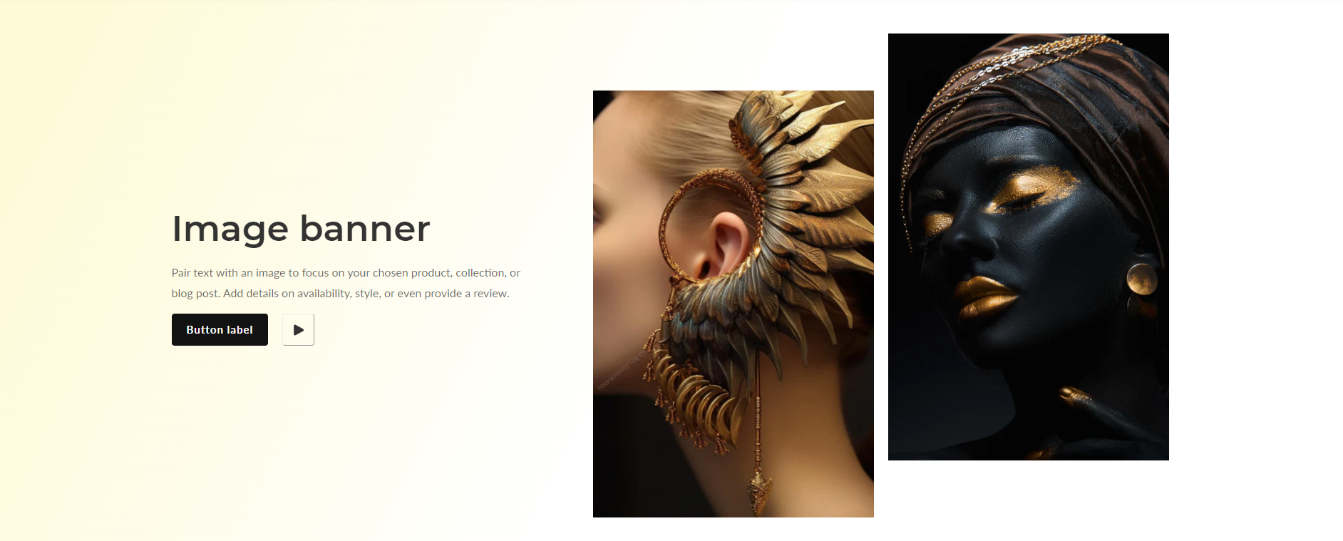
| First image | Upload the primary image for the banner. If only the main image is used, it will display across the full width of the column. |
| Second image | Upload an additional image for the banner. If a secondary image is used, it will appear to the left of the main image. |
| Image height | Adapt to first image: Uses the aspect ratio of the slider’s first image the other images are cropped. Small: This is the smallest height of the slider. Desktop height: 350px. Medium: This is the medium height of the slider. Desktop height: 500px. Large: This is the maximum height of the slider. Desktop height: 600px. |
| Show the space in the two column image | Enable this option to display the images in a two-column format. When checked, the main image will occupy one column, and if a secondary image is uploaded, it will be displayed in the adjacent column, creating a side-by-side layout. This layout enhances visual interest and allows for a more dynamic presentation of banner content. Special Note: ( “It works when you upload the first and second image” ) |
| Desktop image placement | Image First and Image Second: This option determines the placement of images on desktop devices. Image First: Selecting this option will display the main image first, followed by the accompanying content. Image Second: Choosing this option will display the accompanying content first, followed by the secondary image. |
| Make section full width on desktop | Click on the checkbox to Make section full width on desktop. Enabling this option will expand the section to occupy the entire width of the screen on desktop devices, providing a visually immersive experience. |
| Settings | Description |
|---|---|
| Show the space in the two column image | To include space between images in a two-column layout, follow these instructions: Show Space Between Columns: Click on the checkbox labeled “Show space between columns”. Enabling this option will add a margin between the two images, ensuring a visually balanced and aesthetically pleasing layout. |
| Settings | Description |
|---|---|
| Color scheme | Choose a color scheme for this section from the options provided below. |
| Background gradient color | Set up background gradient color for this section from here. |
| Settings | Description |
| Desktop: Padding top | The section’s bottom inner space height is determined. From 0 to 150 px, it will be incremented by 5px. It will affect the desktop. |
| Desktop: Padding bottom | The section’s top inner space height is determined. From 0 to 150 px, it will be incremented by 5px. It will affect the mobile. |
| Mobile: Padding top | The section’s bottom inner space height is determined. From 0 to 150 px, it will be incremented by 5px. It will affect the desktop. |
| Mobile: Padding bottom | The section’s bottom inner space height is determined. From 0 to 150 px, will be incremented by 5px. It will affect the desktop. |
| Settings | Description |
|---|---|
| Heading | Enter extensive text for the title of the text box. |
| Heading size | The size of the heading text: -Small -Medium -Large -Extra large |
| Settings | Description |
|---|---|
| Content | Enter extensive text for the Content of the text box. |
| Settings | Description |
|---|---|
| Button label | The text appears on the button. Note: ( “Leave the label blank to hide the button.” ) |
| Button link | The web URL you wish the button to direct to. |
| Button style | To select a button style, please choose either the “Secondary” or “Primary” option. |
| Button size | The size of the button: -Small -Medium -Large |
| Video button | To enable the video button feature, follow these steps: Input Video URL: Provide the URL of the video you want to link to the button. This could be a link to a video hosted on a video-sharing platform like YouTube. Once the video URL is inputted, the video button will be enabled, allowing users to click on the button to access the specified video. |