Address
304 North Cardinal St.
Dorchester Center, MA 02124
Work Hours
Monday to Friday: 7AM - 7PM
Weekend: 10AM - 5PM


| Settings | Description |
| Number of columns on desktop | You can select a “text with icons” column per row following the options (3, 4) for the desktop device. |
| Number of columns on mobile | Horizontal (Default): You can display icons/images and content horizontally by selecting the option Vertical: You can display icons/images and content Vertically by selecting the option |
| Settings | Description |
| Color scheme | You can change the color of the section. |
| Settings | Description |
| Round the corners | You can enable/disable the round corners. |
| Border | You can enable/disable the card border. |
| Content placement | You can set the card content alignment to Left/Right/Center. |
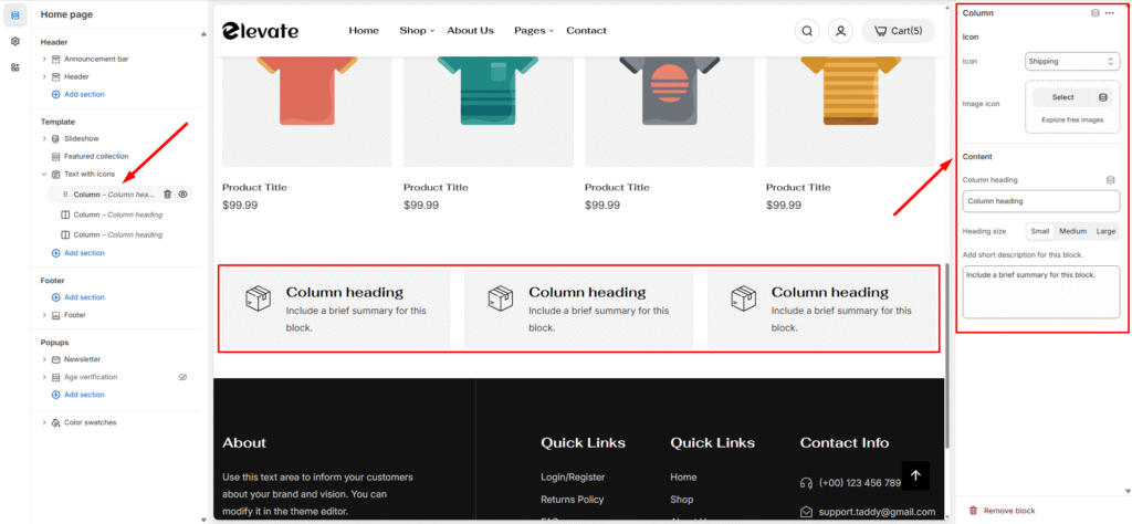
| Settings | Description |
| Icon | By default, the icon is displayed. You can change icons from selection icons. |
| Image image | You can upload a custom 70 x 70px image if none of the above icons are suitable for you. If uploading an image, the Image will be displayed instead of icons. |
| Heading | RichText: You can add a title using the RichText editor. Learn more about this |
| Description | Add a short description. |
| Settings | Description |
| Desktop: Padding top | The section’s top inner space height is determined. From 0 to 150 px, will be incremented by 5px. It will affect the desktop. |
| Desktop: Padding bottom | The section’s bottom inner space height is determined. From 0 to 150 px, will be incremented by 5px. It will affect the desktop. |
| Mobile: Padding top | The section’s top inner space height is determined. From 0 to 150 px, will be incremented by 5px. It will affect the mobile. |
| Mobile: Padding bottom | The section’s bottom inner space height is determined. From 0 to 150 px, will be incremented by 5px. It will affect the desktop. |