Address
304 North Cardinal St.
Dorchester Center, MA 02124
Work Hours
Monday to Friday: 7AM - 7PM
Weekend: 10AM - 5PM

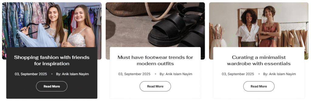
Grid Style
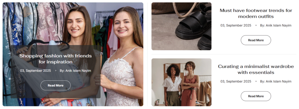
Collage style
| Settings | Description |
| Heading | RichText: You can add a section title using the RichText editor. Learn more about this |
| Heading size | The size of the heading text: -Extra small -Small -Medium -Large -Extra large |
| Subheading | This is the section subtitle. |
| Heading alignment | Left: Aligns the content to the left. Right: Aligns the content to the right. Center: Aligns the content to the center. |
| Settings | Description |
| Layout | Blog Selection: —————- Blog – Choose which blog to display (e.g., “News”) Blog posts – Set number of posts to show (adjustable slider, e.g., 3 posts) Card Display Style: ———————- Grid – Traditional grid layout for blog posts Collage – Mixed layout with varied post sizes |
| Slider settings | Control slider behavior when enabled: Slider Configuration: ———————- Enable slider – Toggle slider/carousel functionality Desktop columns – Choose 2, 3, or 4 columns for desktop Mobile columns – Select 1 or 2 columns for mobile devices Navigation Controls: ———————– Auto-rotate slides – Enable automatic slide progression Show navigation – Display navigation arrows Navigation position – Top or Middle placement Navigation type – Solid or Outline button style Navigation color – Select color scheme (e.g., “Scheme 4”) Note: If navigation is “Middle”, “View all” appears at top; if “Top”, it appears at bottom. |
| Card settings | Customize individual blog post card appearance: Image Settings: —————— Show featured image – Display post thumbnail images Image height – Large, Medium, or Small options Round the corners of the image – Enable rounded image corners Note: Works with Grid card style. Best results with 2:3 aspect ratio images. Content Display: —————— Content alignment – Left, Center, or Right text alignment Show content – Display post excerpts Show date – Display publication dates Show author – Include author information Show comment – Display comment counts Show button – Add “Read More” buttons Button Customization: ————————- Button label – Custom button text (e.g., “Read More”) Button type – Secondary or Primary style Button size – Small, Medium, or Large options |
| Button settings (View all) | if list includes more blog than shown Button label – Customize button text (e.g., “View all”) Button style – Secondary, Primary, or Link options. |
| Color scheme | Card color scheme – Apply consistent colors across all collection cards Color scheme for – Additional color customization options |
| Settings | Description |
| Desktop: Padding top | The section’s top inner space height is determined. From 0 to 150 px, will be incremented by 5px. It will affect the desktop. |
| Desktop: Padding bottom | The section’s bottom inner space height is determined. From 0 to 150 px, will be incremented by 5px. It will affect the desktop. |
| Mobile: Padding top | The section’s top inner space height is determined. From 0 to 150 px, will be incremented by 5px. It will affect the mobile. |
| Mobile: Padding bottom | The section’s bottom inner space height is determined. From 0 to 150 px, will be incremented by 5px. It will affect the desktop. |