Address
304 North Cardinal St.
Dorchester Center, MA 02124
Work Hours
Monday to Friday: 7AM - 7PM
Weekend: 10AM - 5PM
| Settings | Description |
| Heading | RichText: You can add a section title using the RichText editor. Learn more about this |
| Heading size | The size of the heading text: -Extra small -Small -Medium -Large -Extra large |
| Subheading | This is the section subtitle. |
| Heading alignment | Left: Aligns the content to the left. Right: Aligns the content to the right. Center: Aligns the content to the center. |
| Settings | Description |
| Layout | Grid – Traditional grid layout for collections Slider – Carousel-style scrolling display |
| Grid settings | Desktop columns – Choose 1-6 columns for desktop display Mobile columns – Select 1-2 columns for mobile devices |
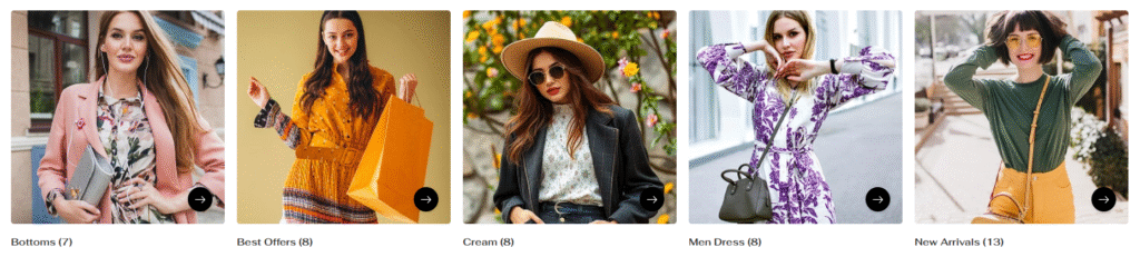
| Card settings | Choose how content appears on collection cards: Standard – Basic card layout Content inside with overlay – Text overlaid on collection image Content inside with button – Text and button overlaid on image Image ratio: ————- Adapt to image – Uses collection image’s natural aspect ratio (cropped) Portrait – 2:3 cropping ratio for taller images Square – 1:1 cropping ratio for square images Circle – Images cropped to 100% rounded circles Round corners – Enable rounded corners for collection images Show zoom on hover – Enable/disable image zoom effect on mouse hover Show product count – Display number of products in each collection Show arrow button – Toggle visibility of navigation arrows Button Style: ————- Secondary – Outlined button style Primary – Filled button style Button Size: ————– Large – Bigger button for emphasis Medium – Standard button size Small – Compact button size Card color scheme: card color scheme for every card. |
| Button settings (View all) | if list includes more collections than shown Button label – Customize button text (e.g., “View all”) Button style – Secondary, Primary, or Link options. |
| Color scheme | Card color scheme – Apply consistent colors across all collection cards Color scheme for – Additional color customization options |
If you enable the layout slide, the slider settings will be working fine
| Settings | Description |
| Auto-rotate slides | A slide show can be set to play automatically. |
| Change slides every | Determine how frequently to update slides. Minimum 1s and maximum 10s |
| Show navigation | You can hide/show slider navigation next/prev arrow button. You can go to the next/prev slide by clicking the next/prev buttons. |
| Hover background color | This is the navigation button hover background color. |
| Hover text color | This is the navigation button text hover color, |
| Settings | Description |
| Collection | Select collection – Choose which collection to display for this specific collection card |
| Image | You can add a collection image from the customizer. Optional! Instead of the collection’s image, the selected image will be displayed. |
| Heading | Add custom heading text for the collection block |
| Link | Set custom destination URL for the collection block |
| Settings | Description |
| Section title alignment | Left: Aligns the content to the left. Right: Aligns the content to the right. Center: Aligns the content to the center. |
| Number of columns on mobile | You can select a product column per row following the options (1, 2). Except for the collage layout, Works on all other layouts. |
| Settings | Description |
| Desktop: Padding top | The section’s top inner space height is determined. From 0 to 150 px, will be incremented by 5px. It will affect the desktop. |
| Desktop: Padding bottom | The section’s bottom inner space height is determined. From 0 to 150 px, will be incremented by 5px. It will affect the desktop. |
| Mobile: Padding top | The section’s top inner space height is determined. From 0 to 150 px, will be incremented by 5px. It will affect the mobile. |
| Mobile: Padding bottom | The section’s bottom inner space height is determined. From 0 to 150 px, will be incremented by 5px. It will affect the desktop. |