Address
304 North Cardinal St.
Dorchester Center, MA 02124
Work Hours
Monday to Friday: 7AM - 7PM
Weekend: 10AM - 5PM
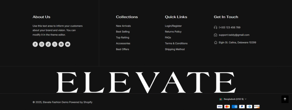
| Settings | Description |
| Enable full-width section on desktop | Turn this option on if you want the section to span the entire width of the screen on desktop devices. By default, the content is aligned within the theme container for better readability. Enabling this setting will make the section stretch edge-to-edge across the screen. |
| Color scheme | You can change the color of the footer. Its color scheme is based on your main theme, “Color Settings.” |
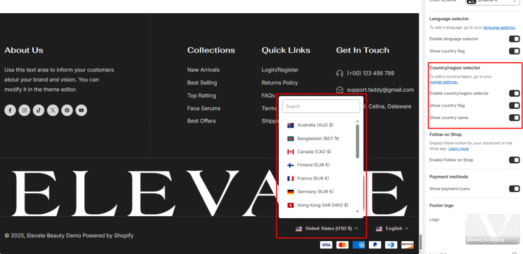
| Settings | Description |
| Enable country/region selector | You can enable/disable multi-currency from the footer. NOTE: To add a country/region, go to your payment settings |
Please follow the instructions-
Go to the page to get more details, Learn more
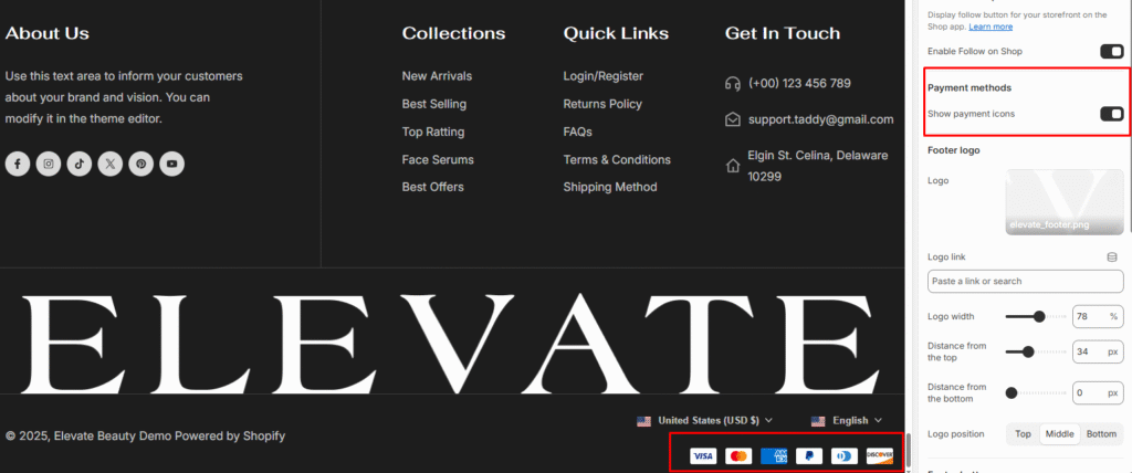
| Settings | Description |
| Show payment icons | If you enable it, the payment icon will appear in the footer. Warning: You must need to set up payment methods in your store. |
| Settings | Description |
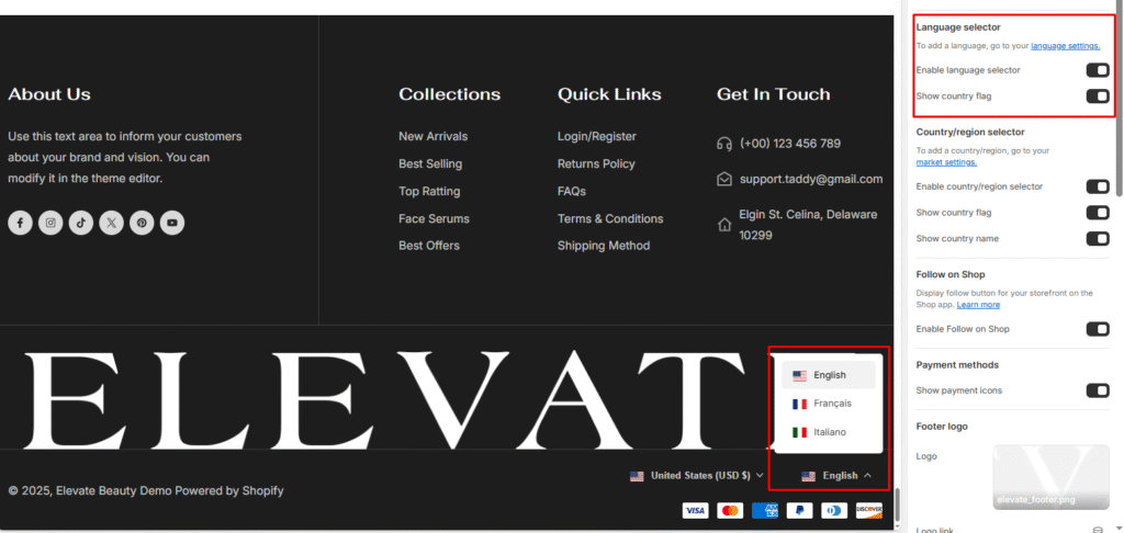
| Enable language selector | You can enable/disable multi-language from the footer. NOTE: To add a language, go to your language settings |
Go to the page to get more details, Learn more
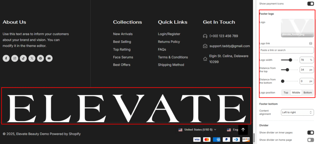
| Settings | Description |
|---|---|
| Footer logo | Upload a custom logo to display in the footer. You can adjust its width, position, and spacing. |
| Logo link | Add a link (e.g., homepage or any custom page) to make the footer logo clickable. |
| Logo width | Control the size of the footer logo by adjusting the width slider. |
| Distance from the top | Set vertical spacing between the top of the footer and the logo. |
| Distance from the bottom | Set vertical spacing between the bottom of the footer and the logo. |
| Logo position | Choose the vertical alignment of the footer logo: Top, Middle, or Bottom. |
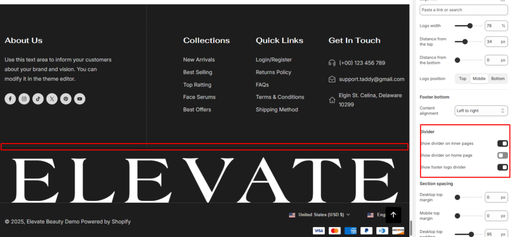
| Settings | Description |
| Content alignment | Center: Left and right side content will be positioned in the center. Left to right: Left and right side content will be positioned left to right alignment. Top to bottom: 2 Columns of content will be positioned top to bottom. |
| Settings | Description |
| Show divider on inner pages | You can show a border on top of the footer section. It will show only for the inner pages, not the home page. |
| Show divider on home page | You can show a border on top of the footer section. It will show only on the home page. |
| Show footer logo divider | You can show a border on top of the footer section. It will only be displayed on the inner pages, not the home page. |
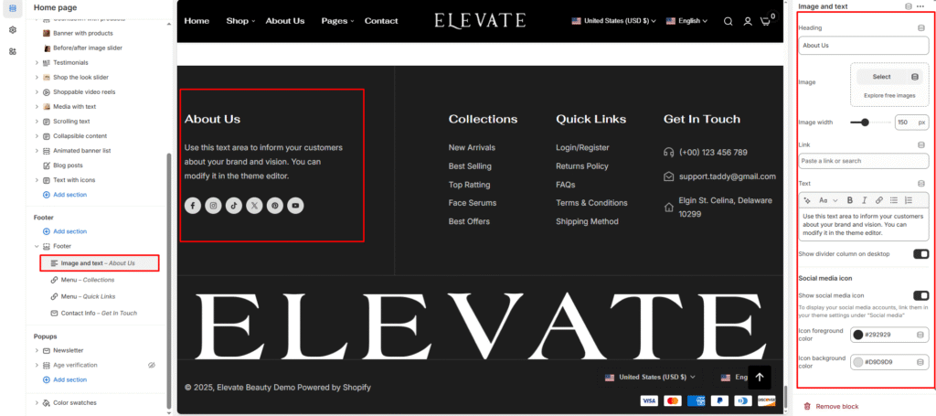
| Settings | Description |
|---|---|
| Heading | Add a title for the block (e.g., About Us). This will be displayed as the section heading in the footer. |
| Image | Upload or select an image to display beside the text. |
| Image width | Adjust the size of the uploaded image by changing its width in pixels. |
| Link | Add a link (optional). When the image or heading is clicked, it will redirect to the specified link. |
| Text | Enter descriptive text about your brand, store, or other information. Rich text options (bold, italic, links, etc.) are supported. |
| Show divider column on desktop | Enable this toggle to display a vertical divider line that separates this block from other footer columns (desktop view only). |
| Show social media icon | Enable to display your social media icons below the text. The icons are linked from your theme’s Social media settings. |
| Icon foreground color | Choose the color of the social media icon symbol (e.g., Facebook “f”). |
| Icon background color | Choose the background color of the social media icon circle. |
| Settings | Description |
| Desktop: Padding top | The section’s top inner space height is determined. From 0 to 150 px, will be incremented by 5px. It will affect the desktop. |
| Desktop: Padding bottom | The section’s bottom inner space height is determined. From 0 to 150 px, will be incremented by 5px. It will affect the desktop. |
| Mobile: Padding top | The section’s top inner space height is determined. From 0 to 150 px, will be incremented by 5px. It will affect the mobile. |
| Mobile: Padding bottom | The section’s bottom inner space height is determined. From 0 to 150 px, will be incremented by 5px. It will affect the desktop. |