Address
304 North Cardinal St.
Dorchester Center, MA 02124
Work Hours
Monday to Friday: 7AM - 7PM
Weekend: 10AM - 5PM
| Settings | Description |
|---|---|
| Page content width | Fixed width (default): This section will display in the default container. (You also change the default layout page width from “Theme Settings“) Full width: This section will be displayed full width in the browser. |
| Section header | RichText: This is the heading for the lookbook section. Learn more about RichText Editor |
| Heading size | Extra Large: This is the large text size of the section heading. Desktop size: 90px, Mobile Size: 45px Large: This is the large text size of the section heading. Desktop size: 79px, Mobile Size: 35px Medium: This is the medium text size of the section heading. Desktop size: 52px, Mobile Size: 30px Small (Default): This is the medium text size of the section heading. Desktop size: 35px, Mobile Size: 25px Extra Small: This is the medium text size of the section heading. Desktop size: 30px, Mobile Size: 22px |
| Subheading | This is the section subtitle. |
| Heading alignment | Left: Aligns the content to the left. Right: Aligns the content to the right. Center: Aligns the content to the center. |
| Mobile heading alignment | Left: Aligns the content to the left. Right: Aligns the content to the right. Center: Aligns the content to the center. |
| Desktop heading position | Top of the section: The heading will display top of the section. Inside the column: The heading will display inside the section. |
| Settings | Description |
|---|---|
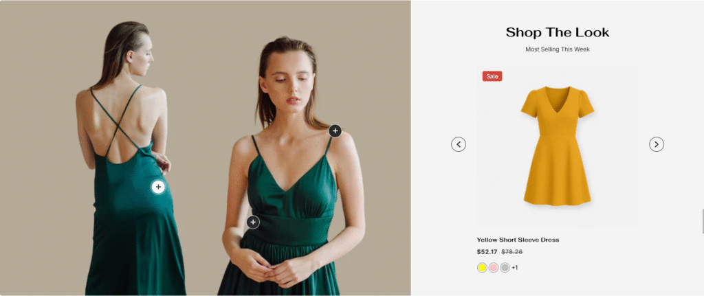
| Image | Upload the lookbook banner image here. |
| Image height | Adapt to image: Uses the aspect ratio of the lookbook image the other images are cropped. Small: This is the smallest height of the lookbook. Desktop height: 478px, Mobile height: 195px Medium: This is the medium height of the lookbook. Desktop height: 500px, Mobile height: 300px Large: This is the maximum height of the lookbook. Desktop height: 695px, Mobile height: 435px |
| Desktop image width | Small: This is the smallest width of the lookbook. Medium: This is the medium width of the lookbook. Large: This is the maximum width of the lookbook. |
| Desktop image placement | Image first: Displays the image on the left. Image second: Displays the text on the left. |
| Round corner | If you enable it, the section corners will be rounded. |
| Product column offset | None: No product column offset. Small: 50px, product column offset. Medium: 100px, product column offset. Large: 150px, product column offset. |
| Settings | Description |
|---|---|
| Image ratio | Adapt to image: The aspect ratio of the collection images is cropped. Portrait: uses a 2:3 cropping ratio to the images. Square: uses a 1:1 cropping ratio to the images. Landscape: uses a 3:2 cropping ratio to the images. |
| Round the corners | If you enable it, the product image corners will be rounded. |
| Show second image on hover | Displays the second product image if the customer hovers their cursor over the product image. |
| Show title | You can change position by following the options. – Top left (default) – Top center – Top right – Bottom left – Bottom center – Bottom right NOTE: Position is automatically optimized for mobile. |
| Show price | You can display, show, or hide product titles for specific sections. |
| Show vendor | You can display, show, or hide product vendors for specific sections. |
| Show product rating | You can display, show, or hide product ratings for specific sections. |
| Show badges | You can display, show, or hide product badges for specific sections. |
| Badge position on desktop | You can change position by following the options. – Top left – Top center – Top right – Bottom left – Bottom center – Bottom right (default) |
| Enable action buttons | Quick shop button: You can enable/disable the quick shop button for the specific section. Cart icon: You can enable/disable the add to cart icon for the specific section. |
| Countdown settings | – You can enable/disable the countdown time. IMPORTANT: You must need to configure a countdown metafield to display the countdown timer for a specific product. Learn more – If you enable it, the countdown timer will be positioned over the product image. By default, the countdown time will be displayed below the product image. – You can change the color of the countdown timer. |
| Settings | Description |
|---|---|
| Color scheme | This is a color scheme option to change the color of the section |
| Hotspot bullet active color | You can change the color of the hotspot bullet. |
| Settings | Description |
|---|---|
| Desktop: Padding top | The section’s top inner space height is determined. From 0 to 150 px, will be incremented by 5px. It will affect the desktop. |
| Desktop: Padding bottom | The section’s bottom inner space height is determined. From 0 to 150 px, will be incremented by 5px. It will affect the desktop. |
| Mobile: Padding top | The section’s top inner space height is determined. From 0 to 150 px, will be incremented by 5px. It will affect the mobile |
| Mobile: Padding bottom | The section’s bottom inner space height is determined. From 0 to 150 px, will be incremented by 5px. It will affect the desktop. |