Address
304 North Cardinal St.
Dorchester Center, MA 02124
Work Hours
Monday to Friday: 7AM - 7PM
Weekend: 10AM - 5PM
| Settings | Description |
| Slide height | Adapt to first image: Uses the aspect ratio of the slider’s first image the other images are cropped. Small: This is the smallest height of the slider. Desktop height: 500px, Mobile height: 280px Medium: This is the medium height of the slider. Desktop height: 650px, Mobile height: 340px Large: This is the maximum height of the slider. Desktop height: 890px, Mobile height: 390px |
| Auto-rotate slides | A slide show can be set to play automatically. |
| Change slides every | Determine how frequently to update slides. Minimum 1s and maximum 10s |
| Show pagination | You can hide/show slider pagination bullet points. The bullet point will help you to present the specific slide. |
| Pagination style | Dots (default): If you select it, the pagination will be displayed as a bullet button. You can go to the next/prev slide by clicking the bullet points. Lines: If you select it, the pagination will be displayed as a line. |
| Pagination color | Dark (default): it will show you as a paginated black color. Light: it will show you as a paginated white color. |
| Settings | Description |
| You can show slider content below the image for mobile device. | You can hide/show slider pagination bullet points for mobile devices. |
| Settings | Description |
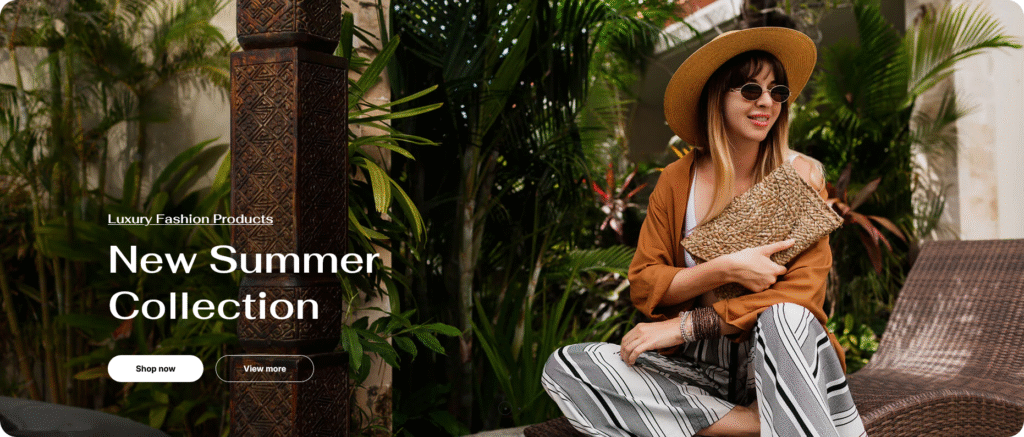
| Desktop image | This is the setting for your slide image. The recommended size is 1920 x 900px |
| Heading | RichText: You can add a slide title using the RichText editor. Learn more about this |
| Heading size | Large: This is the large text size of the section heading. Desktop size: 96px, Mobile Size: 30px Medium: This is the medium text size of the section heading. Desktop size: 70px, Mobile Size: 28px Small: This is the medium text size of the section heading. Desktop size: 50px, Mobile Size: 25px |
| Subheading | You can add subheadings for a single slide using the RichText editor. Learn more about this. |
| Button label | This is a button for a single slide. Leave the label blank to hide the button. |
| Button link | This is a link for the button. |
| Button type | Primary: Use a solid background button style Secondary: Use outline button style |
| Button size | You can change the button size by following the options (Large, medium, small) |
| Image overlay opacity | You can add an overlay on the image from 0 to 100%. |
| Desktop content position | You can change the text color of the slide. |
| Content alignment | Left: Aligns the content to the left. Right: Aligns the content to the right. Center: Aligns the content to the center. |
| Text color | You can change text color of the slide. |
| Mobile image | This is the setting for your slide image on mobile. The recommended size is 600 x 480px |
| Mobile content alignment | You can change the content alignment only for mobile, Left: Aligns the content to the left. Right: Aligns the content to the right. Center: Aligns the content to the center. |
| Settings | Description |
| Desktop: Padding top | The section’s top inner space height is determined. From 0 to 150 px, will be incremented by 5px. It will affect the desktop. |
| Desktop: Padding bottom | The section’s bottom inner space height is determined. From 0 to 150 px, will be incremented by 5px. It will affect the desktop. |
| Mobile: Padding top | The section’s top inner space height is determined. From 0 to 150 px, will be incremented by 5px. It will affect the mobile. |
| Mobile: Padding bottom | The section’s bottom inner space height is determined. From 0 to 150 px, will be incremented by 5px. It will affect the desktop. |