Address
304 North Cardinal St.
Dorchester Center, MA 02124
Work Hours
Monday to Friday: 7AM - 7PM
Weekend: 10AM - 5PM
| Settings | Description |
|---|---|
| Heading | Large text for the title of the section. |
| Heading size | The size of the heading text: -Extra large -Large -Medium -Small -Extra small |
| Subheading | This is the section subtitle. |
| Desktop heading alignment | Left: Aligns the content to the left. Right: Aligns the content to the right. Center: Aligns the content to the center. |
| Mobile heading alignment | Left: Aligns the content to the left. Center: Aligns the content in the center. Right: Aligns the content to the right. |
| Button label | Leave the label blank to hide the button. |
| Button link | Leave the link blank to disable the button. |
| Button type | You can change the button size by following the options (Large, Medium, small) |
| Button size | Adapt to first image: Uses the aspect ratio of the slider’s first image; the other images are cropped. Small: This is the smallest height of the slider. Desktop height: 350px. Medium: This is the medium height of the slider. Desktop height: 450px. Large: This is the maximum height of the slider. Desktop height: 600px. |
| Header layout | Horizontal: Vertical: |
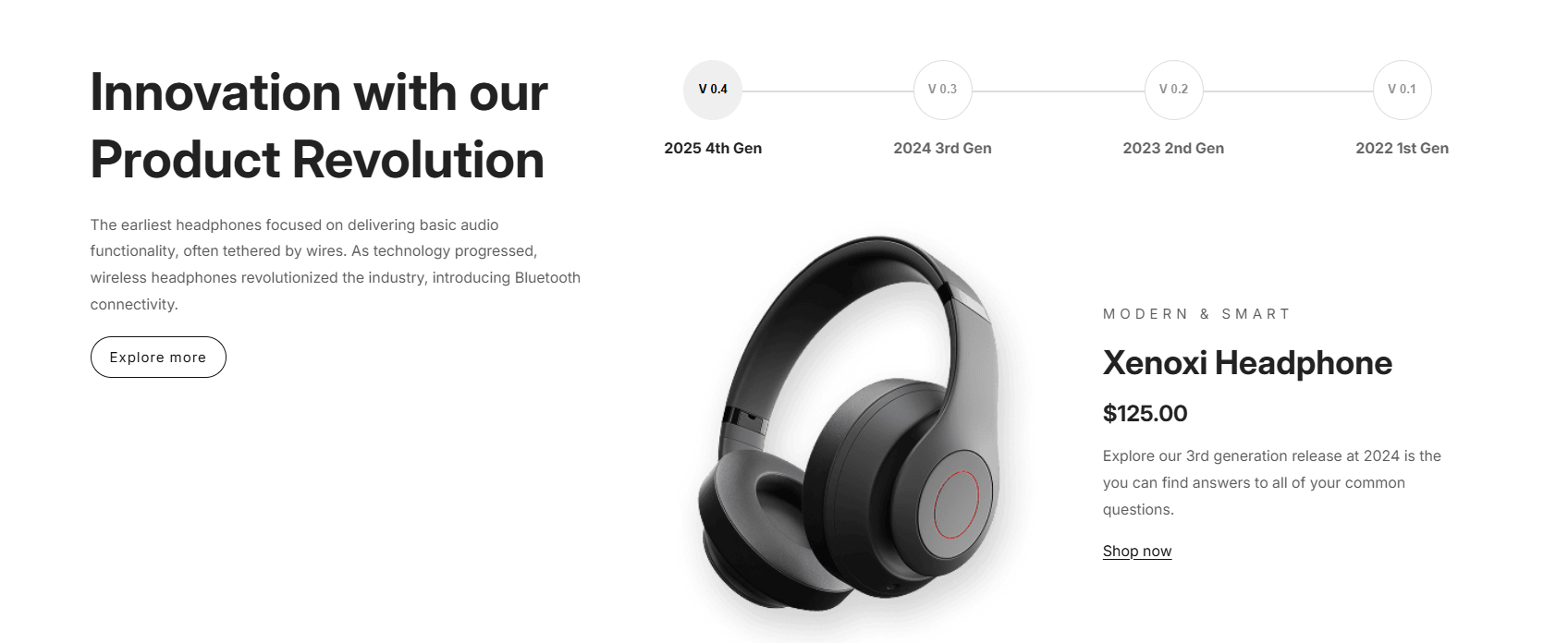
Timeline card
| Settings | Description |
| Image height | Adapt to first image: Uses the aspect ratio of the slider’s first image; the other images are cropped. Small: This is the smallest height of the slider. Desktop height: 350px. Medium: This is the medium height of the slider. Desktop height: 450px. Large: This is the maximum height of the slider. Desktop height: 600px. |
| Navigation active color | Select your custom color for text |
| Navigation active background | Select your custom color for the Background |
| Color scheme |
| Settings | Description |
|---|---|
| Navigation heading | This heading is used for the navigation section. |
| Navigation label | This label is for the Navigation label. |
| Image | The image that you want to display. |
| Enable transparent image | Activate this option to allow the use of transparent images within the application. |
| Heading | Large text for the title of the block. |
| Heading size | The size of the heading text: -Small -Medium -Large |
| Heading two | Large text for the title of the block. |
| Heading two size | The size of the heading text: -Small -Medium -Large |
| Subheading | This is the block subtitle. |
| Description | This is the block description. |
| Button label | The text appears on the button. Note: ( “Leave the label blank to hide the button.” ) |
| Button link | The web URL you wish the button to direct to. |
| Button style | To select a button style, please choose either the “Secondary”, “Primary” or “Link” options. |
| Button size | The size of the button: -Small -Medium -Large Note: Works on the primary/secondary button |
| Desktop content position | You can change the position by following the options. – Top – Middle – Bottom |
| Desktop content alignment | You can change the alignment by selecting the desired option. – Left – Center – Right |
| Settings | Description |
|---|---|
| Padding top (desktop) | The section’s top inner space height is determined. From 0 to 150 px, will be incremented by 5px. It will affect the desktop. |
| Padding bottom (desktop) | The section’s bottom inner space height is determined. From 0 to 150 px, will be incremented by 5px. It will affect the desktop. |
| Padding top (mobile) | The section’s top inner space height is determined. From 0 to 150 px, will be incremented by 5px. It will affect the mobile. |
| Padding bottom (mobile) | The section’s bottom inner space height is determined. From 0 to 150 px, it will be incremented by 5px. It will affect the desktop. |