Customize how products appear on collection pages and throughout your store.
How to Access
- Go to Admin → Online Store → Themes
- Click Customize on your theme
- Select Theme Settings → Product Card
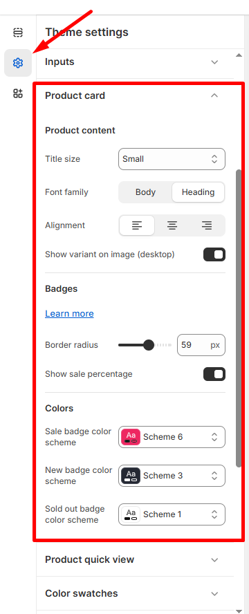
Product Content
Title Settings
- Title size: Choose Small, Medium, or Large
- Font family: Select Body or Heading font style
- Alignment: Left, center, or right alignment options
Display Options
- Show variant on image (desktop): Toggle product variant previews on hover
Badges
Badge Styling
- Border radius: Adjust badge corners (default: 59px for rounded badges)
- Show sale percentage: Display discount percentages on sale items
Badge Colors
- Sale badge: Choose from available color schemes (e.g., Scheme 6)
- New badge: Select color scheme for new products (e.g., Scheme 3)
- Sold out badge: Pick color scheme for out-of-stock items (e.g., Scheme 1)
💡 Tip: Consistent badge styling across your store creates a professional appearance.
Click Save to apply product card updates across all collection pages.