Customize the appearance of form fields, search bars, and input elements across your store.
How to Access
- Go to Admin → Online Store → Themes
- Click Customize on your Taddy theme
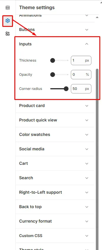
- Select Theme Settings → Inputs
Input Styling Options
Border Styling
- Thickness: Adjust input field border width (default: 1px)
- Opacity: Control border transparency (0-100%)
- Corner radius: Set rounded corners (default: 50px for pill-shaped inputs)
Visual Effects
- Thickness: Controls the prominence of input borders
- Opacity: Creates subtle or bold border appearance
- Corner radius: Ranges from sharp corners (0px) to fully rounded (50px+)
Form Applications
These settings apply to all input elements including:
- Search bars
- Contact forms
- Newsletter signup fields
- Account creation forms
- Checkout input fields
Tip: Higher corner radius values create more modern, pill-shaped inputs while lower values create traditional rectangular fields.
Click Save to apply your color scheme across the entire store.