Address
304 North Cardinal St.
Dorchester Center, MA 02124
Work Hours
Monday to Friday: 7AM - 7PM
Weekend: 10AM - 5PM
| Settings | Description |
|---|---|
| Section header | RichText: This is the heading for the featured collection section. Learn more about RichText Editor |
| Heading size | Extra Large: This is the large text size of the section heading. Desktop size: 56px, Mobile Size: 30px Large: This is the large text size of the section heading. Desktop size: 40px, Mobile Size: 28px Medium: This is the medium text size of the section heading. Desktop size: 36px, Mobile Size: 25px Small (Default): This is the medium text size of the section heading. Desktop size: 28px, Mobile Size: 22px Extra Small: This is the medium text size of the section heading. Desktop size: 24px, Mobile Size: 20px |
| Description | This is the description for the featured collection section. Learn more about RichText Editor |
| Heading alignment | Left: Aligns the content to the left. Right: Aligns the content to the right. Center: Aligns the content to the center. |
| Settings | Description |
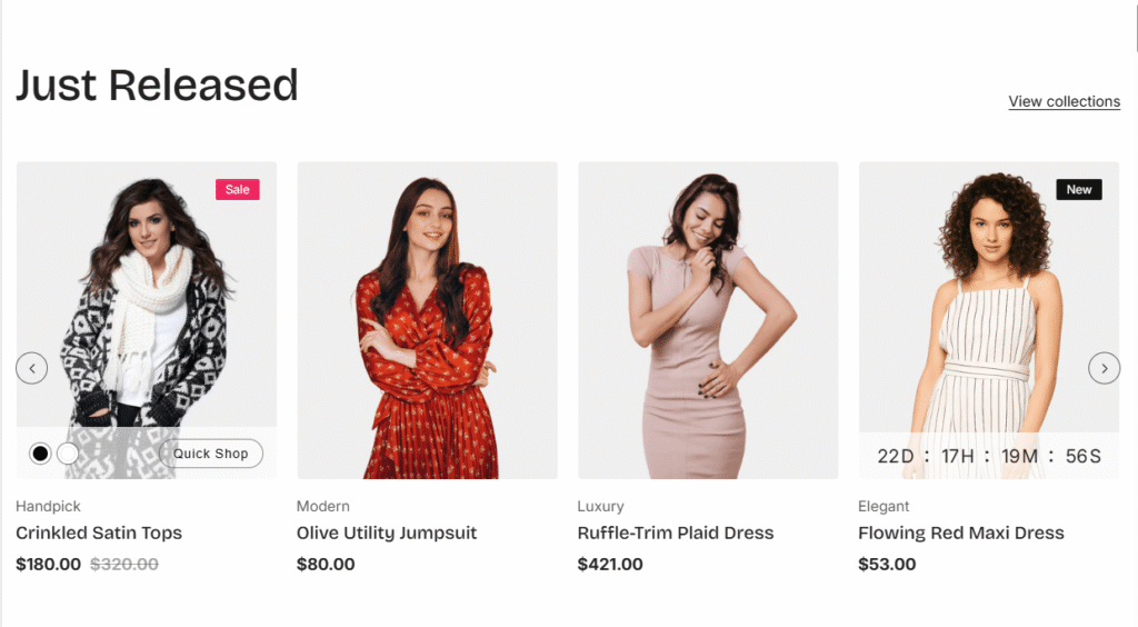
| Style (Tab selection) | Grid: Displays products in a static grid layout Slider: Displays products in a carousel/slider format that customers can scroll through |
| Maximum products to show (Slider + Number field) | Controls the total number of products displayed in this section |
| Number of columns on desktop (Button options) | Options: 2, 3, 4, 5 columns |
| Number of columns on mobile (Button options) | Options: 1 or 2 columns |
| Color scheme for countdown | You can change the color of the countdown timer. |
| Position the countdown on the image for desktop | If you enable it, the countdown timer will be positioned over the product image. By default, the countdown time will be displayed below the product image. |
| Settings | Description |
| Auto-rotate slides (Toggle) | When enabled: Slider automatically advances to the next product When disabled: Customers must manually navigate through products |
| Change slides every (Slider + Number field) | Sets the time interval for automatic slide rotation |
| Show navigation | When enabled: Displays navigation controls for the slider |
| Button style | Square: Navigation buttons appear as square shapes Round: Navigation buttons appear as circular/rounded shapes |
| Navigation position | Top of the section: Buttons appear top on the sides Middle of the section: Buttons appear centered vertically on the sides |
| Position the countdown on the image for desktop | If you enable it, the countdown timer will be positioned over the product image. By default, the countdown time will be displayed below the product image. |
| Settings | Description |
| Card options (Tab selection) | Default: Uses standard product card layout with preset fields Personalize: Unlocks customization options to manage product information display |
| Image ratio | Adapt to image: Uses the aspect ratio of the collection images is cropped. Portrait: uses a 2:3 cropping ratio to the images. Square: uses a 1:1 cropping ratio to the images. Landscape: uses a 3:2 cropping ratio to the images. |
| Round the corners of the image | If you enable it, the product image corners will be rounded. |
| Show second image on hover | Displays the second product image if the customer hovers their cursor over the product image. |
| Show title | You can display show/hide product titles for specific sections. |
| Show price | You can display show/hide product prices for specific sections. |
| Show vendor | You can display show/hide product vendors for specific sections. |
| Show product rating | You can display show/hide product ratings for specific sections. |
| Show badges | You can display show/hide product badges for specific sections. |
| Badge position on desktop | You can change position follow the options, – Top left (default) – Top center – Top right NOTE: Position is automatically optimized for mobile. |
| Enable quick shop button | You can enable/disable the quick shop button for the specific section |
| Show countdown | You can enable/disable countdown time. IMPORTANT: You must need to configure a countdown metafield to display the countdown timer for a specific product. Learn more |
| Color scheme for countdown | You can change the color of the countdown timer. |
| Position the countdown on the image for desktop | If you enable it, the countdown timer will be positioned over the product image. By default, the countdown time will be displayed below the product image. |
| Settings | Description |
| Enable “View all” button if collection has more products than shown | A “View all” button appears and directs customers to the collection page if the collection contains more products than the Maximum products to show field allows. |
| Button label | Leave the label blank to hide the button. |
| Button type | Primary: Use a solid background button style Secondary: Use outline button style |
| Button size | You can change the button size follow the options, (Large, medium, small) |
| Button position | Top: Show button top of the section Bottom: Show button bottom of the section |
| Settings | Description |
| Padding top (desktop) | The section’s top inner space height is determined. From 0 to 150 px, will be incremented by 5px. It will affect the desktop. |
| Padding bottom (desktop) | The section’s bottom inner space height is determined. From 0 to 150 px, will be incremented by 5px. It will affect the desktop. |
| Padding top (mobile) | The section’s top inner space height is determined. From 0 to 150 px, will be incremented by 5px. It will affect the mobile. |
| Padding bottom (mobile) | The section’s bottom inner space height is determined. From 0 to 150 px, will be incremented by 5px. It will affect the desktop. |