Address
304 North Cardinal St.
Dorchester Center, MA 02124
Work Hours
Monday to Friday: 7AM - 7PM
Weekend: 10AM - 5PM
| Settings | Description |
| Page content width | Fixed width (default): This section will display in the default container. (You also change the default layout page width from “Theme Settings“) Full width: This section will be displayed full width in the browser. |
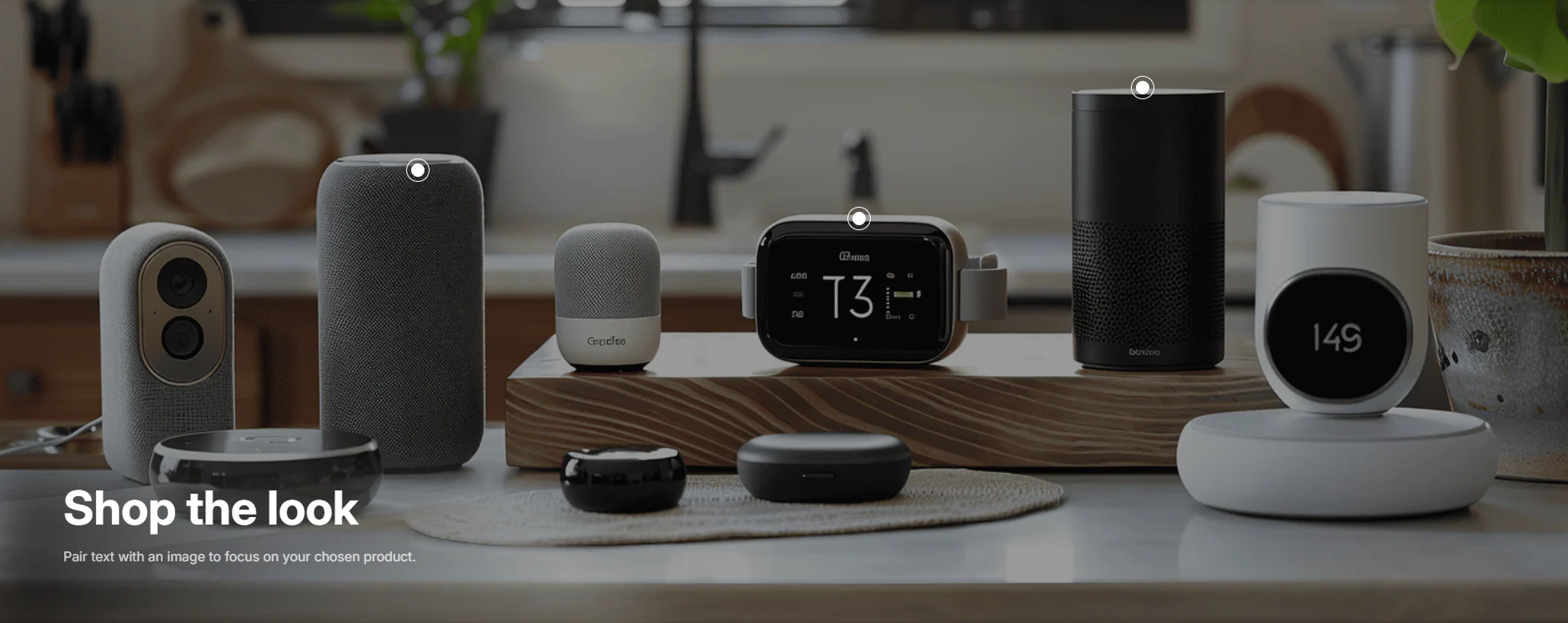
| Image | This is the main image of the lookbook. |
| Image height | Adapt to image: Uses the aspect ratio of the collection images is cropped. Small: This is the smallest height of the lookbook image. Desktop height: 314px, Mobile height: 194px Medium: This is the medium height of the lookbook image. Desktop height: 500px, Mobile height: 300px Large: This is the maximum height of the lookbook image. Desktop height: 695px, Mobile height: 435px |
| Make section full width | You can display images and content full width in a section container. |
| Round corner | Enable rounded corners for the banner image. Small, Medium, Large |
| Heading | RichText: This is the heading for the lookbook section. Learn more about RichText Editor |
| Heading size | Large: This is the large text size of the section heading. Desktop size: 50px, Mobile Size: 30px Medium (Default): This is the medium text size of the section heading. Desktop size: 40px, Mobile Size: 28px Small: This is the medium text size of the section heading. Desktop size: 32px, Mobile Size: 25px |
| Content | This is the text for the lookbook section. |
| Button label | This is a button for a single slide. Leave the label blank to hide the button. |
| Button link | This is a link for the button. |
| Button type | Primary: Use a solid background button style Secondary: Use outline button style |
| Button size | You can change the button size by following the options (Large, Medium, Small) |
| Desktop content position | You can change position by following the options. – Top – Middle – Bottom NOTE: Position is automatically optimized for mobile. |
| Round corner | If you enable it, the section corners will be rounded. |
| Color scheme | This is a color scheme option to change the color of the section |
| Settings | Description |
| Desktop: Padding top | The section’s top inner space height is determined. From 0 to 150 px, will be incremented by 5px. It will affect the desktop. |
| Desktop: Padding bottom | The section’s bottom inner space height is determined. From 0 to 150 px, will be incremented by 5px. It will affect the desktop. |
| Mobile: Padding top | The section’s top inner space height is determined. From 0 to 150 px, will be incremented by 5px. It will affect the mobile. |
| Mobile: Padding bottom | The section’s bottom inner space height is determined. From 0 to 150 px, will be incremented by 5px. It will affect the desktop. |
| Settings | Description |
| Product | The product that you want to display. |
| Enable quick shop | Instead of redirecting customers to the product details page, this option displays a popup with all of the important product details. |
| Horizontal position | Provides a measurement for the space between the bullet and the image’s left edge. |
| Vertical position | Provides a measurement for the space between the bullet and the image’s top edge. |
| Enable quick shop | True/False |
| Use custom color for hotspot | This is the bullet-gradient background color. |