Address
304 North Cardinal St.
Dorchester Center, MA 02124
Work Hours
Monday to Friday: 7AM - 7PM
Weekend: 10AM - 5PM
| Settings | Description |
| Show container offset | True/Faslse |
| Slide height | Adapt to first image: Uses the aspect ratio of the slider’s first image; the other images are cropped. Small: This is the smallest height of the slider. Desktop height: 500px, Mobile height: 280px Medium: This is the medium height of the slider. Desktop height: 650px, Mobile height: 340px Large: This is the maximum height of the slider. Desktop height: 890px, Mobile height: 390px Fit: Automatically adjusts the slider height based on each image’s original aspect ratio — no cropping. Each image displays in full within the available width. |
| Show corner radius | True/False Corner radius options: -Small -Medium -Large |
| Navigate and tab menu position | Left: Aligns the content to the left. Right: Aligns the content to the right. Center: Aligns the content in the center. |
| Animation type | Slide/Fade |
| Auto-rotate slides | A slide show can be set to play automatically. |
| Change slides every | Determine how frequently to update slides. Minimum 1s and maximum 10s |
| Show pagination | You can hide/show slider pagination bullet points. The bullet point will help you to present the specific slide. |
| Enable navigation | You can hide or show the slider’s navigation arrows. These arrows let users manually move to the previous or next slide. |
| Pagination color |
| Settings | Description |
| You can show slider content below the image for mobile devices. | You can hide/show slider pagination bullet points for mobile devices. |
| Enable the color scheme slider and tab menu | Enable the color scheme slider and tab menu |
| Color on mobile | Only works when the color scheme slider and tab menu option are enabled above. |
| Settings | Description |
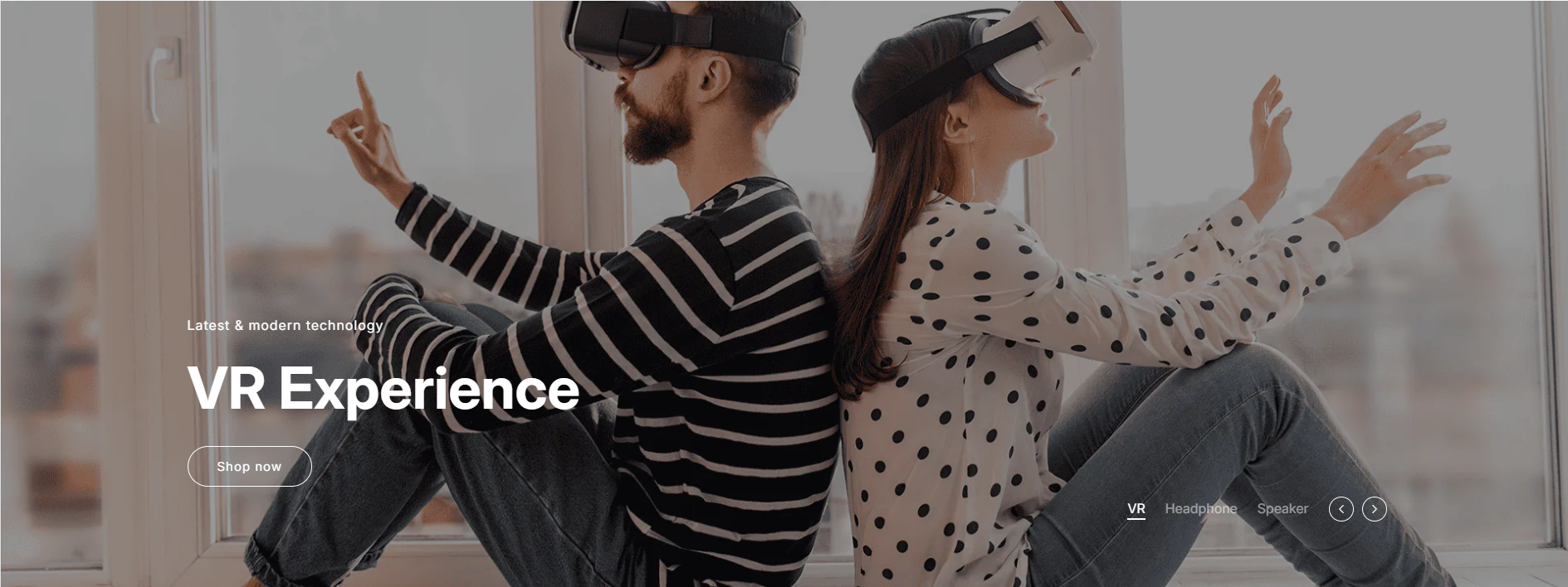
| Desktop image | This is the setting for your slide image. The recommended size is 1920 x 900px |
| Show image overlay | Type: True / False Enable this option to display a color overlay on top of the slider image. When enabled, you can adjust the overlay color and opacity (0–100%) to control how dark or light the overlay appears. |
| Content | Customize the text and layout displayed on each slide. You can set the subheading, heading, description, and button details to create engaging promotional messages or highlight featured products. |
| Subheading | You can add subheadings for a single slide using the Rich Text editor. Learn more about this |
| Subheading letter spacing | -Tight -Normal -Loose |
| Heading | RichText: You can add a slide title using the Rich Text editor. Learn more about this |
| Heading size | Large: This is the large text size of the section heading. Desktop size: 96px, Mobile Size: 30px Medium: This is the medium text size of the section heading. Desktop size: 70px, Mobile Size: 28px Small: This is the medium text size of the section heading. Desktop size: 50px, Mobile Size: 25px |
| Heading line-height | – Small – Medium – Large |
| Description | You can change the text color of the slide. |
| Button label | This is a button for a single slide. Leave the label blank to hide the button. |
| Button link | This is a link for the button. |
| Button type | Primary: Use a solid background button style Secondary: Use outline button style |
| Button size | You can change the button size by following the options (Large, Medium, Small) |
| Desktop content position | Select the position of the slide’s text content (subheading, heading, description, and button) on desktop screens. You can place the content at the top, middle, or bottom, and align it to the left, center, or right of the slide. The position is automatically optimized for mobile devices. |
| Content alignment | Left: Aligns the content to the left. Right: Aligns the content to the right. Center: Aligns the content to the center. |
| Text color | You can change the text color of the slide. |
| Tab title | Tab item title |
| Mobile image | This is the setting for your slide image on mobile. The recommended size is 600 x 480px |
| Mobile content alignment | You can change the content alignment only for mobile. Left: Aligns the content to the left. Center: Aligns the content in the center. Right: Aligns the content to the right. |
| Settings | Description |
| Desktop: Padding top | The section’s top inner space height is determined. From 0 to 150 px, will be incremented by 5px. It will affect the desktop. |
| Desktop: Padding bottom | The section’s bottom inner space height is determined. From 0 to 150 px, will be incremented by 5px. It will affect the desktop. |
| Mobile: Padding top | The section’s top inner space height is determined. From 0 to 150 px, will be incremented by 5px. It will affect the mobile. |
| Mobile: Padding bottom | The section’s bottom inner space height is determined. From 0 to 150 px, will be incremented by 5px. It will affect the desktop. |