Address
304 North Cardinal St.
Dorchester Center, MA 02124
Work Hours
Monday to Friday: 7AM - 7PM
Weekend: 10AM - 5PM
| Settings | Description |
| Heading | RichText: You can add a section title using the Rich Text editor. Learn more about this |
| Heading size | The size of the heading text: -Extra small -Small -Medium -Large -Extra large |
| Description | This is the section Description. |
| Heading alignment | Left: Aligns the content to the left. Center: Aligns the content in the center. Right: Aligns the content to the right. |
Layout settings
| Settings | Description |
| Card style | -Card -Standard |
| Image ratio | The image ratio for the promotion is as follows: Original(Default): The aspect ratio of the images is used. This prevents cropping of the images. Square: Images are cropped to a 1:1 aspect ratio. Portrait: Images are cropped to a 4:5 aspect ratio. Landscape: Images are cropped to a 3:2 aspect ratio. Circle: Images are cropped into a 1:1 aspect ratio and displayed within a circular frame, giving a clean and modern look. |
| Title size | Extra small: This is the extra small text size of the section heading. Desktop size: 30px, Mobile Size: 22px Small: This is a small text size for the section heading. Desktop size: 30px, Mobile Size: 25px Medium: This is the medium text size of the section heading. Desktop size: 38px, Mobile Size: 28px Large: This is the large text size of the section heading. Desktop size: 40px, Mobile Size: 30px Extra Large: This is the extra-large text size of the section heading. Desktop size: 56px, Mobile Size: 34px |
| Content alignment | Left: Aligns the content to the left. Center: Aligns the content in the center. Right: Aligns the content to the right. |
| Corner radius | True/False: Keeps image corners sharp. Corner round the corners of the image: Small – Slightly rounded image corners. Medium – Moderately rounded image corners. Large – More rounded corners than medium for a softer look. |
| Show product count | This is an option to show how many products are in a collection. |
| Use arrow icons | True/False |
| Icon type | If you use the arrow icon, true show (Arrow right or arrow right up) |
If you enable the layout slide, the slider settings will be working fine
| Settings | Description |
| Auto-rotate slides | A slide show can be set to play automatically. |
| Change slides every | Determine how frequently to update slides. Minimum 1s and maximum 10s |
| Show navigation | You can hide/show the slider navigation next/prev arrow button. You can go to the next/previous slide by clicking the next/previous buttons. |
| Button style | This is the navigation button two style, Square and Round |
| Navigation position | This navigation has two options: 1. Middle of the section, and 2. Top of the section |
| Settings | Description |
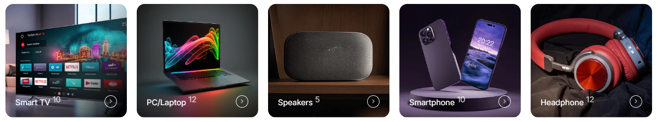
| Collection | Select collection – Choose which collection to display for this specific collection card |
| Image | You can add a collection image from the customizer. Optional! Instead of the collection’s image, the selected image will be displayed. |
| Heading | Add custom heading text for the collection block |
| Link | Set a custom destination URL for the collection block |
| Settings | Description |
| Enable the “View all” button if the list includes more collections than shown | The “View all” button will appear automatically if the collection list contains more items than the number currently shown. |
| Button label | Leave the label blank to hide the button. |
| Button type | You can change the button size by following the options (Large, Medium, small) |
| Button size | You can change the button size by following the options (Large, Medium, Small) |
| Button position | Top: Show button top of the section Bottom: Show button bottom of the section |
| Settings | Description |
| Desktop: Padding top | The section’s top inner space height is determined. From 0 to 150 px, will be incremented by 5px. It will affect the desktop. |
| Desktop: Padding bottom | The section’s bottom inner space height is determined. From 0 to 150 px, will be incremented by 5px. It will affect the desktop. |
| Mobile: Padding top | The section’s top inner space height is determined. From 0 to 150 px, will be incremented by 5px. It will affect the mobile. |
| Mobile: Padding bottom | The section’s bottom inner space height is determined. From 0 to 150 px, will be incremented by 5px. It will affect the desktop. |