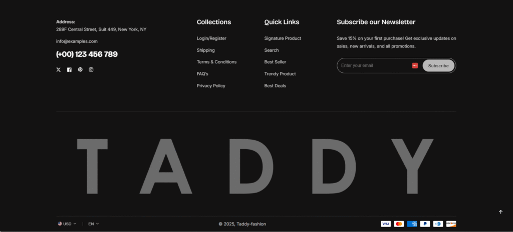
Address
304 North Cardinal St.
Dorchester Center, MA 02124
Work Hours
Monday to Friday: 7AM - 7PM
Weekend: 10AM - 5PM
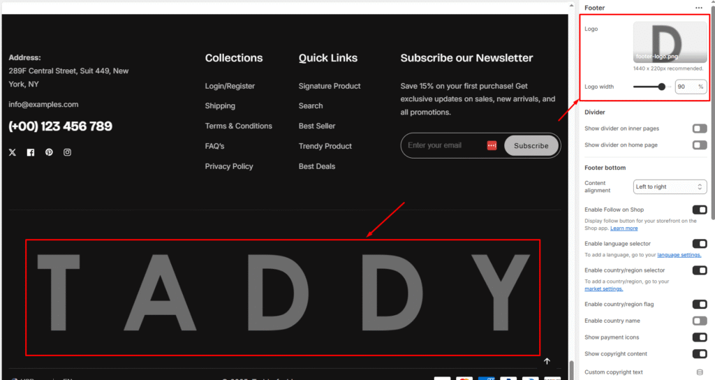
| Settings | Description |
| Logo (Image upload) | Upload your footer logo image. Recommended size: 1440 x 220px |
| Logo width | Adjusts the size of the footer logo. Example shown: 90% |
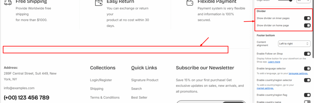
| Settings | Description |
| Show divider on inner pages | Adds a horizontal line separator on inner pages (product pages, about page, etc.) |
| Show divider on home page | Adds a horizontal line separator specifically on the homepage |
| Settings | Description |
| Content alignment | Center: Example shown: Centered Left to right: Example shown: Left to right  Top to bottom: Example shown: Top to bottom  |
| Enable Follow on Shop | When enabled: Displays a “Follow” button for your storefront on the Shop app |
| Enable language selector | You can enable/disable multi-language from the footer. NOTE: To add a language, go to your language settings How to setup Multi-language in your store — From your Shopify admin, go to Settings > Languages. — Click Add Language. — Choose a language from the drop-down menu, then click Add. — Select an active market to add your language. Go to the page to get more details, Learn more 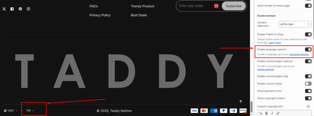 |
| Enable country/region selector (Multi-Currency) | You can enable/disable multi-currency from the footer. NOTE: To add a country/region, go to your payment settings How to setup Payments in your store Please follow the instructions- — From your Shopify admin, go to Settings > Payments. — In the Shopify Payments section, click Manage. Go to the page to get more details, Learn more 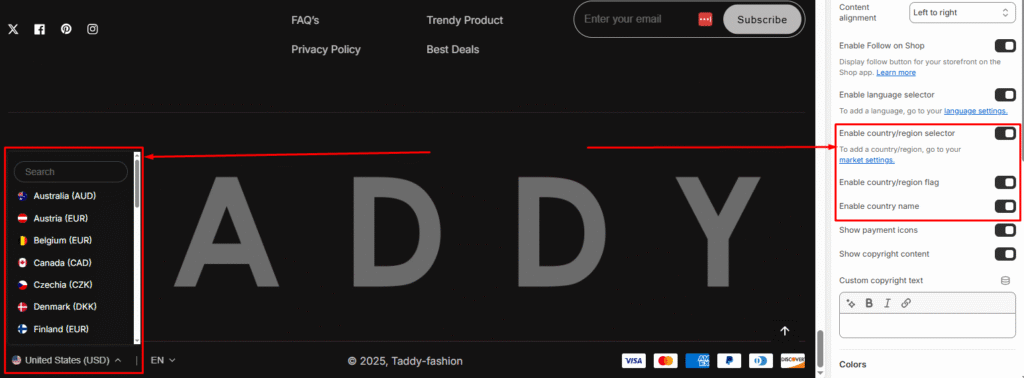 |
| Show payment icons | If you enable it, the payment icon will appear in the footer. Warning: You must need to set up payment methods in your store. 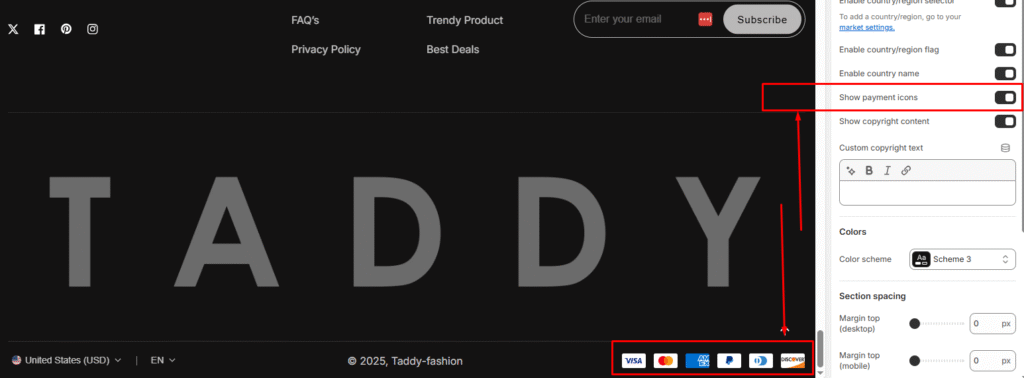 |
| Show copyright content | Displays copyright text in footer bottom. Example shown: “© 2025, Taddy-fashion“ |
| Custom copyright text (Rich text field) | Allows you to write custom copyright information |
| Settings | Description |
| Color scheme | You can change the color of the footer. Its color scheme is based on your main theme, “Color Settings.”. Multiple schemes available to match your store design |
| Settings | Description |
|---|---|
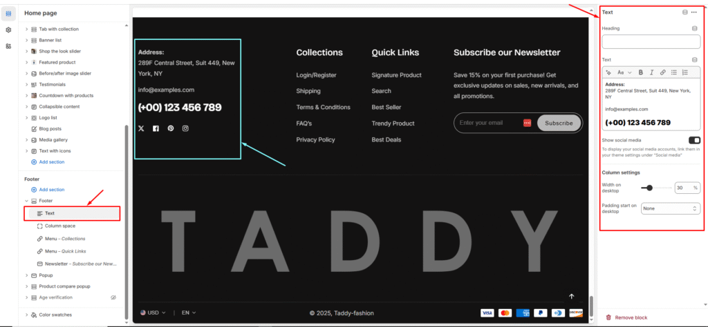
| Heading | Add a title for the block (e.g., About Us). This will be displayed as the section heading in the footer. |
| Text | Enter descriptive text about your brand, store, or other information. Rich text options (bold, italic, links, etc.) are supported. |
| Show social media icon | Enable to display your social media icons below the text. The icons are linked from your theme’s Social media settings. |
| Column Settings | Width on desktop: Controls how much horizontal space this text block occupies in the footer Padding start on desktop: Controls spacing/padding on the left side |
| Settings | Description |
| Margin top (desktop) | The section’s top outside margin height is determined. From 0 to 150 px, will be incremented by 5px. It will affect the desktop. |
| Margin top (mobile) | The section’s bottom outside margin height is determined. From 0 to 150 px, will be incremented by 5px. It will affect the desktop. |
| Settings | Description |
| Padding top (desktop) | The section’s top inner space height is determined. From 0 to 150 px, will be incremented by 5px. It will affect the desktop. |
| Padding bottom (desktop) | The section’s bottom inner space height is determined. From 0 to 150 px, will be incremented by 5px. It will affect the desktop. |
| Padding top (mobile) | The section’s top inner space height is determined. From 0 to 150 px, will be incremented by 5px. It will affect the mobile. |
| Padding bottom (mobile) | The section’s bottom inner space height is determined. From 0 to 150 px, will be incremented by 5px. It will affect the desktop. |