Address
304 North Cardinal St.
Dorchester Center, MA 02124
Work Hours
Monday to Friday: 7AM - 7PM
Weekend: 10AM - 5PM
| Settings | Description |
| Logo | Upload your store logo through Theme Settings > Logo Logo appears on all pages by default |
| General | Show container offset on desktop for expanded header layout |
| Desktop logo position | When a customer views the site on a large screen, such as a desktop computer, the logo appears in the header. Logo left, menu center – Classic layout with logo on the left and menu centered. Logo left, menu below – Logo on top with navigation menu placed below it. Logo center, menu left – Logo centered while the menu aligns to the left. Logo center, menu below – Clean design with centered logo and menu positioned underneath. Logo center, menu drawer – Centered logo with a collapsible drawer-style menu. |
| Menu | This is the main menu for your store. |
| Menu alignment | Center: Aligns the menu item to the center. Left: Aligns the menu item to the left. Right: Aligns the menu item to the right. |
| Show cart icon | Enable/disable cart access (disabling removes cart functionality) |
| Show user icon | Toggle account/login icon visibility |
| Show search icon | Control search functionality access |
| Search appearance | Search box – Displays a visible search bar directly in the header. Search popup – Opens a popup drawer when the search icon is clicked. |
| Border position | None – No border is displayed. Top – Shows a border at the top only. Bottom – Displays a border at the bottom only. Both – Adds borders to both top and bottom. |
| Sticky header | Control header visibility during scrolling: Sticky Options: None – Header scrolls normally On Scroll Up – Header reappears when scrolling up Always – Header always visible Always, reduce logo size – Header always visible and logo size will be reduce. Sticky Customization: Sticky header background color – Custom background when sticky Sticky header text color – Text color for sticky state |
| Text with icon | Show text with icon for enable text with icon. It works only when ‘Logo center, drawer menu’ is selected as the logo position. Icon – The selected icon appears before your heading text. Icon width – Adjusts the size of the icon. Heading (Rich text field) – The main text that appears next to the icon. Description (Rich text field) – Additional supporting text below the heading. Link (URL field) – Makes the entire text with icon section clickable. |
| Settings | Description |
| Enable on homepage | Activate transparent header for homepage only |
| Logo | Upload a different logo specifically for transparent header (homepage only) |
| Settings | Description |
| Submenu | Customize color scheme for submenu/mega menu specifically |
| Megamenu | Enable mega menu full width display for expanded navigation |
| Settings | Description |
| Mobile | Optimize header display and functionality for mobile devices: Mobile-Specific Features: Show social media icons – Display social media links in mobile header Enable country/region selector – Add location switching for mobile users market settings. Show currency flag – Display currency indicators on mobile Enable language selector – Add language switching for mobile users Show language flag – Display language flag icons on mobile Configuration Links: Market Settings – Configure countries/regions through your market settings language settings. Language Settings – Set up languages through your language settings |
| Settings | Description |
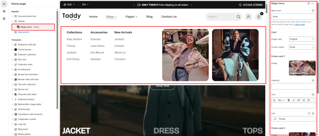
| Menu item | Enter the name of the menu item to which you want to add a mega menu. |
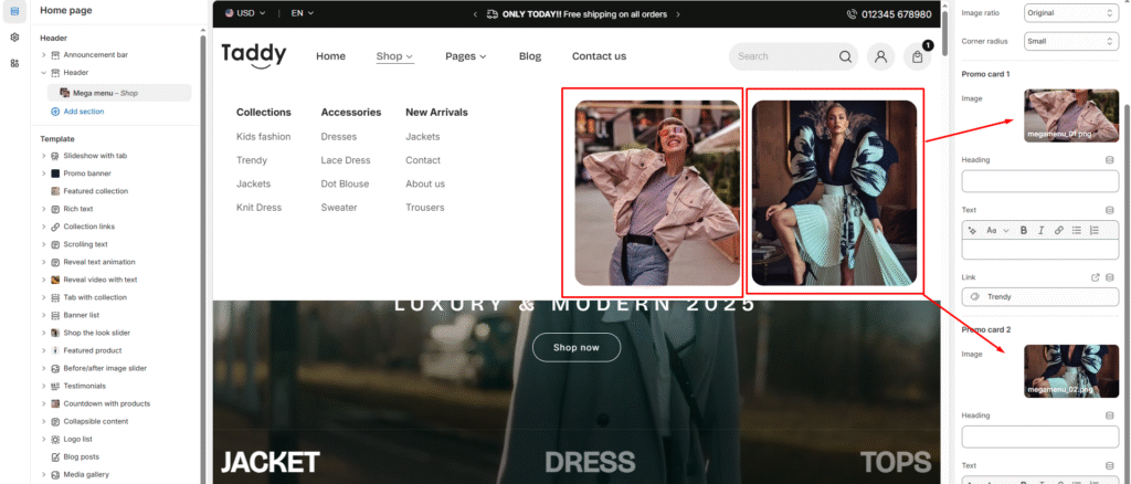
*** You have the option of uploading two images for two promotions. They all have the same settings:
| Settings | Description |
| Image ratio | The image ratio for the promotion is as follows: Original(Default): The aspect ratio of the images is used. This prevents cropping of the images. Square: Images are cropped to a 1:1 aspect ratio. Portrait: Images are cropped to a 4:5 aspect ratio. Landscape: Images are cropped to a 3:2 aspect ratio. Wide: Images are cropped to a 16:9 aspect ratio. |
| Corner radius | Round the corners of the image None – Keeps image corners sharp. Small – Slightly rounded image corners. Medium – Moderately rounded image corners. Large – More rounded corners than medium for a softer look. |
| Image | This is a setting to display an image in the mega menu as a promotion. |
| Heading | A promotion title can be displayed. If you don’t want it to be displayed, simply clear the field. |
| Text | A promotion text can be displayed. If you don’t want it to be displayed, simply clear the field. |
| Link | You can add a link to a single promotion. |