- Here’s a refined version of those instructions:
How to Access
- Go to Admin → Online Store → Themes
- Click Customize on your theme
- Select Theme Settings → Colors
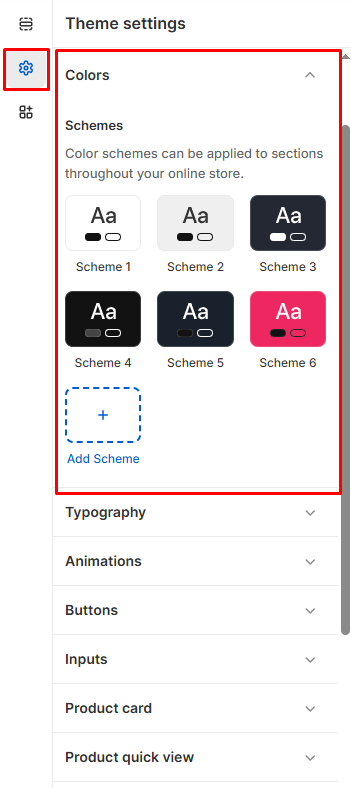
Color Schemes
Pre-built Schemes
- 6 default schemes: Choose from ready-made color combinations (Scheme 1-6)
- Quick preview: See how each scheme looks with sample text
- Add Scheme: Create additional custom color schemes
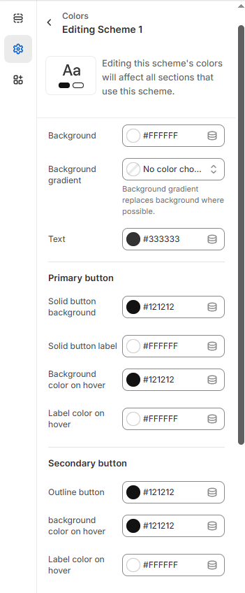
Editing Schemes
Click any scheme to customize its colors:
Color Categories
General Elements
- Background: Main page background color
- Background gradient: Optional gradient overlay
- Text: Primary text color for body content
Button Styling
Primary Buttons
- Solid button background: Main CTA button color
- Solid button label: Text color on primary buttons
- Background color on hover: Hover state for primary buttons
- Label color on hover: Text color when hovering
Secondary Buttons
- Outline button background: Secondary button styling
- Background color on hover: Hover effects
- Label color on hover: Text color changes
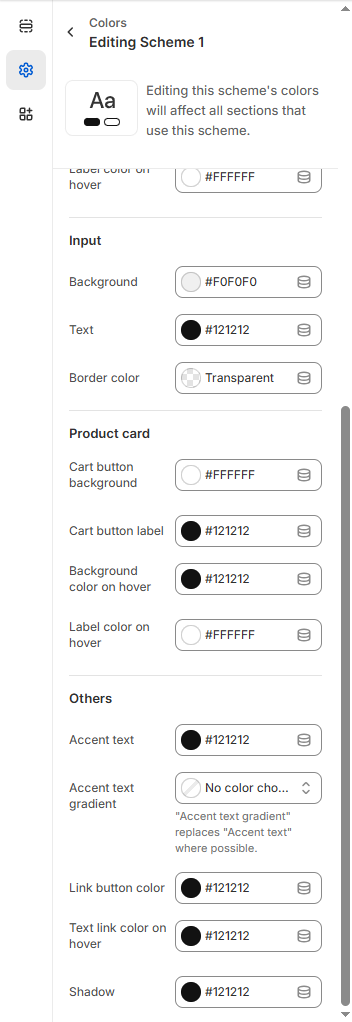
Form Elements
- Input background: Form field background color
- Input text: Text color inside form fields
- Border color: Input field borders (can be transparent)
Product Cards
- Cart button background: Add to cart button styling
- Cart button label: Button text color
- Background/label hover states: Interactive effects
Accent Colors
- Accent text: Highlight text color
- Accent text gradient: Optional gradient effects
- Link button color: Clickable link styling
- Text link hover: Link hover effects
- Shadow: Drop shadow effects
Color Picker Options
- Hex codes: Enter specific color values (e.g.,
#FFFFFF)
- Color wheel: Visual color selection
- Transparency: Set transparent options where available
- Gradients: Create smooth color transitions
Tip: Maintain good contrast between text and backgrounds for accessibility. Test colors on both light and dark elements.
Click Save to apply your color scheme across the entire store.